December 18, 2024

Release Notes for Safari Technology Preview 210

Surfin’ Safari

Safari Technology Preview Release 210 is now available for download for macOS Sequoia and macOS Sonoma. If you already have Safari Technology Preview installed, you can update it in System Settings under General → Software Update.

This release includes WebKit changes between: 286708@main…287517@main.

CSS

New Features

  • Added support for the text-autospace property. (286750@main) (140008990)

Resolved Issues

  • Fixed updating the base background color where the root has color set explicitly when switching to light or dark modes. (286833@main) (139917332)
  • Fixed performance of querySelectorAll() with :has() descendant selectors. (286908@main) (140093151)
  • Fixed the unicode-bidi default for the <bdo> element. (287175@main) (140662417)

DOM

New Features

  • Added support for the ::details-content pseudo-element. (286891@main) (129786929)

JavaScript

Resolved Issues

  • Fixed: Updated Intl.DurationFormat to not include grouping for 2-digit or numeric styles. (287393@main) (140962232)
  • Fixed Intl.PluralRules pluralCategories to follow a specific order. (287411@main) (140965181)

Rendering

New Features

  • Implemented <details> and <summary> disclosure triangle as a list item. (286869@main) (95148788)

Resolved Issues

  • Fixed outside list-style-position quirk to only be applicable in quirks mode. (287114@main) (140602985)

Web Animations

New Features

  • Added preview support for Scroll-driven Animations. (287062@main) (140532929)

Web API

Resolved Issues

  • Fixed Navigation.navigate() to trigger the beforeunload event synchronously. (286919@main) (139628818)
  • Fixed innerText behavior for <details> and <summary>. (286799@main) (140172890)

Web Extensions

New Features

  • Added support for documentId in webNavigation. (287408@main) (137532909)

Web Inspector

New Features

  • Added support for sending Android user agents using the device override menu when Web Inspector is connected to a remote device. (287092@main) (139305520)

Resolved Issues

  • Fixed the overview icon to be inverted dark mode in the Graphics tab. (287110@main) (140602803)
  • Fixed recorded WebGL objects not getting highlighted correctly in the Graphics tab. (287127@main) (140625113)

December 18, 2024 10:06 PM

December 16, 2024

Igalia WebKit Team: WebKit Igalia Periodical #6

Igalia WebKit

Update on what happened in WebKit in the week from December 9 to December 16.

Cross-Port 🐱

Web Platform 🌐

Shipped the X25519 algorithm of the WebCrypto API for the Mac, GTK+ and WPE ports.

Fixed corner case invoker issue with popover inside invoker, matching the updated spec.

Form controls have long standing interoperability issues and <textarea> is no exception. This patch fixes space being reserved for scrollbars despite overlay scrollbars being enabled. This brings WebKit in line with Firefox's behaviour.

Implemented improvements to the popover API to allow imperative invokers relationships, this brings the JavaScript APIs inline with the declarative popovertarget attribute.

Implemented the CanvasRenderingContext2D letterSpacing/wordSpacing support.

Multimedia 🎥

GStreamer-based multimedia support for WebKit, including (but not limited to) playback, capture, WebAudio, WebCodecs, and WebRTC.

Due to on-going work on improving memory usage in WebRTC use-cases, several patches landed in WebKit (1, 2,3) and GStreamer (4). Another related task is under review in libnice.

Several WebCodecs GStreamer backend fixes landed, mostly related with Opus and LPCM decoding support.

JavaScriptCore 🐟

The built-in JavaScript/ECMAScript engine for WebKit, also known as JSC or SquirrelFish.

JavaScriptCore now has Wasm tail call support on ARMv7.

Graphics 🖼️

OpenType color fonts with SVG outlines stopped working with the transition from Cairo to Skia. This was unintentional, and support for this kind of fonts has been re-enabled for Skia.

Building the OpenType-SVG support required building Skia's SVG module, which uses Expat as its XML parser. Packagers will need to add it as a build dependency, or configure the compilation passing -DUSE_SKIA_OPENTYPE_SVG=OFF, which disables the feature.

That’s all for this week!

By Unknown at December 16, 2024 01:33 PM

December 10, 2024

Igalia WebKit Team: WebKit Igalia Periodical #5

Igalia WebKit

Update on what happened in WebKit in the week from December 3 to December 10.

Web Platform 🌐

Improved interoperability somewhat by including font-weight in the CanvasRenderingContext2D.font serialization.

Graphics 🖼️

Support for cross-thread transfer of accelerated ImageBitmap objects landed upstream for the GTK and WPE ports. It improves performance of applications that use worker threads and pass accelerated ImageBitmap objects (with ownership) around.

That’s all for this week!

By Unknown at December 10, 2024 10:05 PM

December 09, 2024

WebKit Features in Safari 18.2

Surfin’ Safari

Today marks the arrival of Safari 18.2. With it, WebKit adds 61 new features and 111 resolved issues. Highlights include cross-document View Transitions, the ability to fill a border with a background, spatial videos in visionOS, ruby improvements, input type=week on iOS, iPadOS & visionOS, WASM garbage collection, HTTPS by default, Genmoji, and more.

Safari 18.2 is available on iOS 18.2, iPadOS 18.2, visionOS 2.2, macOS Sequoia 15.2, macOS Sonoma and macOS Ventura.

CSS

Text box

If you write CSS, you’ve probably struggled at some point to optically center text vertically in a box, or to get a headline to line up with the top of an image. Now you can declare which font metric you want the browser to consider the edge of the text box when calculating layout:

h2 {
  text-box: trim-start cap;
}

This means “please do trim the start edge (above the headline) at the cap line”. You can see the effect on the right, where the top of the “H” lines up with the top of the image:

Side by side comparison of with and without "text-box: trim-start cap". With it, the top of the capital H in the headline "Holiday Decorations" lines up perfectly with the top of the photo it's next to.
Learn more by exploring this demo in Safari 18.2.

Originally called “leading trim”, this feature is now simply text-box. It’s a shorthand for two longhands properties— text-box-trim and text-box-edge — which you can declare separately if you need to control how each cascades. Safari 18.2 is the first browser to ship Text Box, but you can use it today to progressively enhance your design, while browsers without support simply fallback to the older bahavior.

View Transitions

WebKit for Safari 18.2 adds support for cross-document View Transitions with @view-transition. This provides a mechanism for easily animating across webpages. It’s especially handy if you are making an app experience where you don’t want users to experience a reload when moving from one page to another. Instead, with View Transitions you can crossfade, swipe, hold steady only changing the new content, and more.

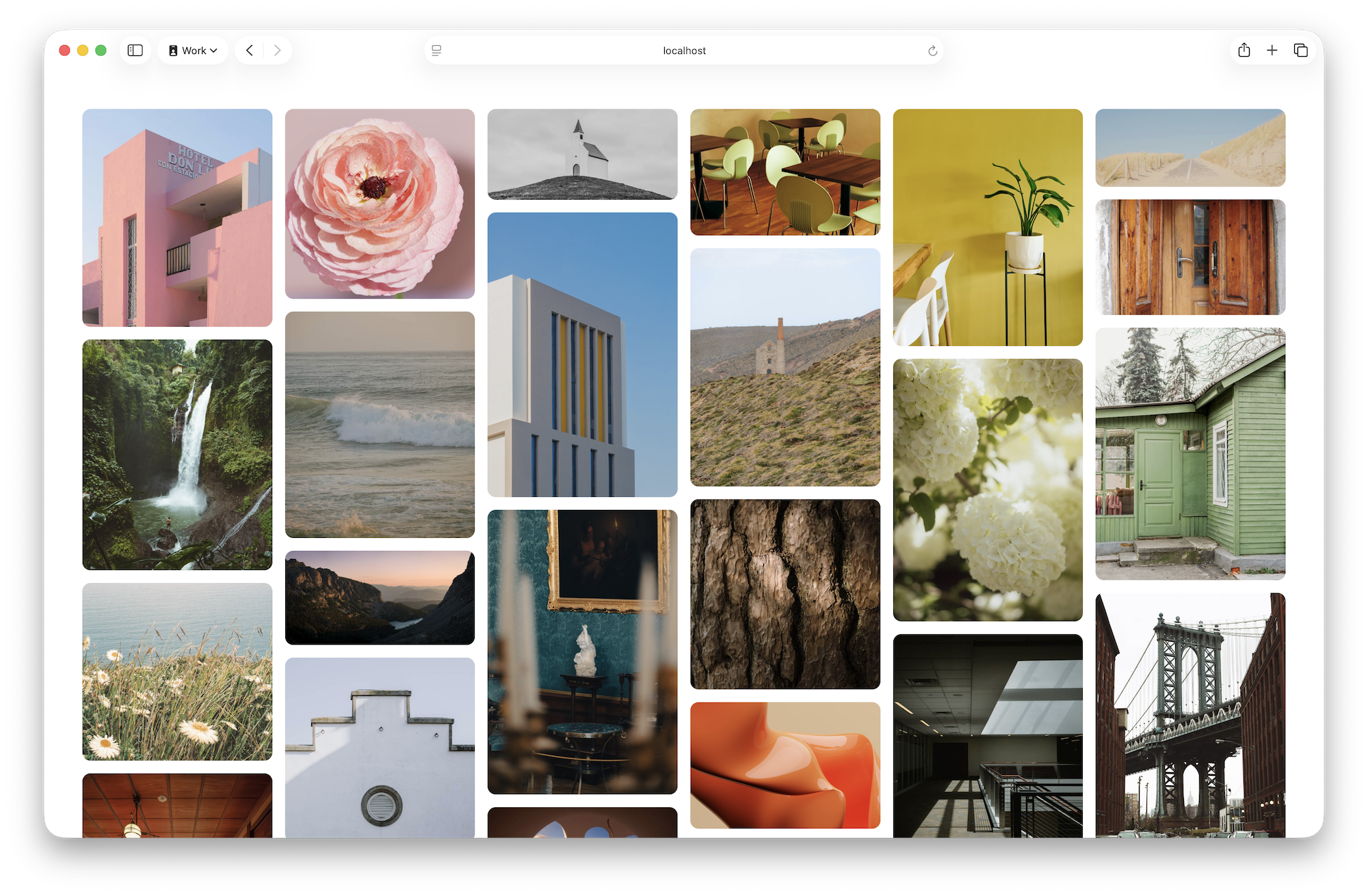
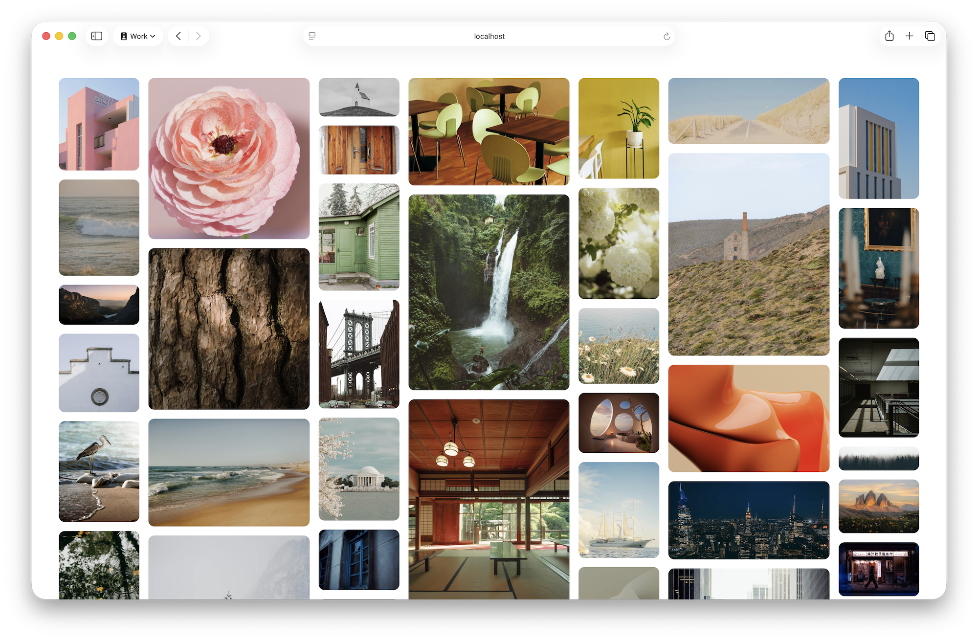
Building on our original support for View Transitions that shipped in Safari 18.0, WebKit for Safari 18.2 adds support for view-transition-name: auto. This means you won’t have to individually name potentially hundreds of different content items if you are applying transitions to the content on a single page. We ran into this problem when we created this masonry-layout demo (switch to “Combined with View Transitions” layout with pulldown menu). With 80 items on the page, we had to write 80 separate lines of code like .card:nth-child(80) { view-transition-name: card-80; } over and over. In the real world, you couldn’t rely on there never being an 81st item, yet more-than-expected items would break the transitions. Now instead, we can just declare .card { view-transition-name: auto } and let the browser figure out the details.

WebKit for Safari 18.2 also adds support for View Transition Classes and View Transition Types. Classes allow you to easily share styles between different view transitions. It can be used very nicely in combination with view-transition-name: auto . Types allow you to define different variants for the same view transition (e.g. slide-in from the right vs. slide-in from the left for a carousel).

And Safari 18.2 adds support for the pageswap and pagereveal events for View Transitions.

Backgrounds on borders

WebKit for Safari 18.2 adds support for background-clip: border-area. It allows you to put a background on a box, and clip that background to only appear in the area where the border exists. It combines nicely with background-clip: text to create interesting visual effects.

The word "woodworking" large on the page, inside a box with a very thick border. Both the text and border are made out of a photo of a wooden board, showing its wood grain.

In this example, we can apply a photo of a wooden table as a background to the box, twice. And then clip each background to the border-area and the text respectively.

header {
  border-width: 30px solid transparent;
  background-image: url("wooden-table.jpg"),
                    url("wooden-table.jpg");
  background-size: cover;
  background-origin: border-box;
  background-clip: border-area,
                   text;
}

For much more about how it works, read Make creative borders with background-clip: border-area.

Division by units and other complex calculations

WebKit for Safari 18.2 updates the calc() function to the most recent web standard, opening up many new possibilities — including dividing by numbers with units. For example, you can convert the current viewport width to pixels with calc(100vw / 1px). Scott Kellum created a demo where the background color of the page is determined by the width of the viewport with this:

html {
  background: hsl(calc(100vw / 1px * 0.2deg), 100%, 80%);
}

Sidelines

WebKit for Safari 18.2 adds support for text-underline-position: left and text-underline-position: right. This lets you shift the position of a sideline to the other side.

:root {
  writing-mode: vertical-rl;
}
[lang]:lang(ja) { 
  text-underline-position: right; 
} 
[lang]:not(:lang(ja)) { 
  text-underline-position: under; 
}
Japanese text typeset vertically, with a sideline on the right of the Japanese text, and a sideline on the left of English text, to underline it
Learn more exploring this demo.

Now that Safari 18.2 supports text-underline-position: right, the User Agent defaults for both underline position and text emphasis marks in have been changed for CJK languages.

Ruby

WebKit for Safari 18.2 adds support for three Ruby properties: ruby-align, ruby-overhang, and the now-unprefixed ruby-position.

The ruby-align property is reminiscent of the alignment properties of Flexbox, Grid, and (as of March 2024) block layout. It provides a mechanism for shifting where ruby annotations appear — whether they group together at the start, or in the center, or spread out with equal amounts of space in-between, or equal amounts of space between & around the annotations.

four diagrams showing the resulting layouts for ruby align
Learn more experimenting with this demo.

Theruby-overhang property let’s you control whether or not ruby annotations are allowed to spill over into the space above the neighboring character.

two diagrams showing the resulting layouts for ruby overhang
Learn more by exploring this demo.

The difference can be subtle, but in the second version in the demo, with ruby-overhang: none, the two characters are more clearly separated so the reader can see that there are separate annotations for each. This does cause awkward inline spacing between characters, interrupting the rhythm of the main line of text — but doing so is helpful for beginner readers of textbooks, for example.

And last, Safari 18.2 unprefixes the ruby-position property. Supported since Safari 7 as -webkit-ruby-position with non-standard values, WebKit now supports the standardized values over, under, and inter-character.

four diagrams showing the resulting layouts for ruby position
Learn more exploring this demo.

Scrollbars

WebKit for Safari 18.2 adds support for scrollbar-width and scrollbar-gutter. If you used computers 13-30 years ago, you’ll remember how different scrollbars used to be. They were always present. They had thick gutters with complex edges. And they included little up and down arrows for clicking on with a mouse. Fifteen years ago, WebKit introduced a way to style these type of scrollbars through the ::-webkit-scrollbar pseudo element.

Today, scrollbars are visually much simpler, often disappearing entirely when not in use. In response to these changes and after many discussions, the CSS Working Group decided to standardize a slimmed down set of tools for styling scrollbars.

Thescrollbar-width property provides three options. The default is auto. The thin value asks for thinner scrollbars. And none can be used to remove scrollbars entirely, while still maintaining a container that’s scrollable. On macOS, scrollbar-width: thin creates a thinner scrollbar. On iOS, iPadOS, and visionOS there is no change — iOS and iPadOS always use thin scrollbars.

Thescrollbar-gutter property provides an opportunity to reserve a space for the scrollbar — the space in which the scrollbar will slide. However, scrollbar-gutter has zero effect anytime a browser is using “overlay scrollbars”. Overlay scrollbars are incredibly common these days. They slide overtop the content of the page, without a visible gutter. macOS, iOS, iPadOS and visionOS all use overlay scrollbars system-wide. On macOS, users can change this behavior if they desire, by going to System Settings > Appearance, and changing “Show scroll bars” to “Always”. Only then, and on some other operating systems, will the scrollbar take up space in the page layout.

The scrollbar-gutter property has three options: auto, stable, and stable both-edges. The initial value is auto, where space is only reserved when the scrollbar is visible — that is, when the box is set to overflow: scroll, or has overflow: auto + enough content to overflow. The scrollbar: stable rule lets you as a web developer instead ask that the gutter always reserves space, which can be helpful for creating layout consistency. The third option, scrollbar-gutter: stable both-edges, asks the browser to not only create a stable space always reserved for the scrollbar, but to also create that same amount of space on both edges of the box. You can see the result below.

Website scrollbars in Safari 18.2 on macOS, with “Show scroll bars” set to “Always” — with and without enough content to cause a scrollbar to appear. Learn more by trying this demo on macOS with overlay scrollbars instead, or on other operating systems.

Scroll to Text Fragments

You might be familiar with anchor links in HTML, where you can send someone a link to a specific anchor on the page — if the web developer of that site created an anchor link for you to use. Scroll to Text Fragments is a tool that allows a user to create a link to any fragment of text on the page, whether or not the site’s developers thought to do so. Support for Scroll to Text Fragments was added in Safari 16.1. Now in Safari 18.2, there’s an easy UI for creating a Text Fragment link.

Here’s how it works. First, go to a web page and highlight the text you want to target with your link. Then choose “Copy Link with Highlight” from the context menu.

a website in Safari on iPad, with a string of text highlighted, and a menu popped open where the user can choose Copy Link with Highlight

The URL looks like this: https://webkit.org/blog/16214/background-clip-border-area/#:~:text=background%2Dclip:%20text. When a user navigates to the URL, the browser will scroll the text fragment into view, and mark it with a persistent highlight.

WebKit for Safari 18.2 also adds support for the ::target-text pseudo-element. It provides a mechanism for the site’s web designer/developer to style text fragment link results for their site.

a website on a phone, with a headline of text highlighted in yellow
The highlight that appears when a user enters a Scroll to Text Fragment URL can now be styled with the ::target-text pseudo-element.

And more CSS

WebKit for Safari 18.2 adds support in CSS selectors for :is(:host). Previously:is() and:host() were supported, but not in this particular combination.

WebKit for Safari 18.2 adds support for using the corner keywords closest-corner and farthest-corner in circle and ellipse shapes. You might recognize these keywords from the radial gradient syntax. It lets you clip an element with syntax like clip-path: circle(closest-corner at 50px 50px).

WebKit for Safari 18.2 adds support for <string> values of the syntax descriptor for @property.

@property --foobar {
   syntax: "<string>";
}

Safari 18.2 adds support for @page margin descriptors. And it adds support to @page for the Japanese standard paper sizes jis-b4 and jis-b5. Also, the size property of @page now parses as a descriptor instead of a global property.

Spatial videos and photos

Safari 18.2 in visionOS 2.2 now supports viewing spatial videos. You can record a spatial video on Vision Pro, iPhone 15 Pro or any iPhone 16, or any camera that records MV-HEVC with spatial metadata. You can then publish it on the web with the HTML video element, just like any other video.

<video controls>
  <source src="birthdayparty.mov" type="video/quicktime; codecs=hvc1.1.6.L123.B0" /> <!-- spatial video -->
  <source src="birthdayparty.webm" type="video/webm" />
</video> 

Any browser that supports HEVC video will play the spatial video file as 2D video on the webpage. In visionOS, Safari 18.2 provides UI alongside the rest of the video controls to allow users to tap to view the video spatially. On first tap, the video appears in a floating frame as the Safari window disappears. Then when the user taps again, the video further expands to create a more immersive experience. When they exit the video, the Safari window returns.

Safari 18.2 in visionOS 2.2 also adds additional support for viewing spatial photos.

Anytime you embed a spatial photo in a web page, it appears inline in 2D, just like any other photo. Starting with Safari 18.0 for visionOS, as a web developer, you could use the JavaScript Fullscreen API to provide a mechanism for spatial photos to escape the webpage and be immersive.

Now, in Safari 18.2, users can view any spatial photo by pinching and holding it, and then selecting “View Spatial Photo”.

a webpage floating in visionOS, with an image on the page, and a menu popped open next to it with View Spatial Photos as an option

You can continue to use Fullscreen API on spatial photos if you’d like to make your own UI. It now also works on spatial videos. They are displayed in a stereoscopic portal with a button allowing users to fully immerse themselves in the content.

WebXR

WebKit for Safari 18.2 in visionOS 2.2 adds support to re-project WebXR content converting depth from forward-Z to reverse-Z. And now, the WebXR Session now includes the enabledFeatures property. When you request an XRSession you list the optionalFeatures and requiredFeatures for your WebXR experience. The enabledFeatures property tells you which features were granted without needing to feature detect them.

Genmoji

The interface for creating a Genmoji, showing three options for "world wide web" — a globe covered in network connection dots, a globe encircled by wires, and a globe with a giant smile plastered across it's face.

WebKit on iOS 18.2 and iPadOS 18.2 adds support for Genmoji. Make a brand-new Genmoji right in the keyboard. Provide a description to see a preview, and adjust your description until you’ve got the perfect custom emoji.

In Safari 18.2, you can post the Genmoji you’ve created to the web. They get added to content as images.

WKWebView supports the full NSAdaptiveImageGlyph API, via the supportsAdaptiveImageGlyph property on WKWebViewConfiguration, making it possible to support adaptive image glyphs in your app. Learn more by watching Bring expression to your app with Genmoji from WWDC24.

Media

WebKit for Safari 18.2 adds support for allowing websites to override the system-default accessibility caption styling. Web Video Text Tracks (WebVTT) are the web’s system for creating subtitles and captions. As a developer, you can style these text tracks with the::cue pseudo-element. In the system accessibility settings on Apple platforms, users can select a system-default caption style, or create their own custom style. Previously, the system-default caption styles would override the website’s styles. Now, system-default caption styles are always overridable, but users may still create custom styles, and prevent those styles from being overridden by the page.

WebKit for Safari 18.2 now adds a fallback image to Now Playing when a website doesn’t specify one in MediaSession metadata.

HTML

iPhone with a calendar showing on a webpage, with UI for selecting a week at a time

Safari 18.2 adds support for input type=week on iOS, iPadOS, and visionOS.

WebKit for Safari 18.2 adds support for blocking=render attribute for <script> and <style>. It allows you to tell the browser to block presenting the rendered page until that particular script or style file is run. This is the default behavior of many resources for a web page, so it’s not often needed. But it’s here if you find yourself in a situation where such a tool (such as a <script> with the async attribute) would be handy. WebKit for Safari 18.2 also adds support for Document render-blocking with <link rel=expect>. It similarly causes the page to be render-blocked until the essential parts of the document are parsed so it will render consistently. These two tools can be especially useful for cross-document View Transitions, where you might want more control over what must be loaded before the animation snapshots can be taken.

WebAssembly

WebKit for Safari 18.2 adds support for WASM Garbage Collection. It allows WebAssembly modules to define a variety of new reference types whose memory is managed automatically by the browser. These types range from simple data types like structs and arrays, to more complex type relationships such as subtyping and recursion. Without WASM GC, source languages that rely on garbage collection (such as Java, C#, Kotlin, Go, and others) generally have to write their own garbage collectors and compile them to WebAssembly. This poses a significant barrier when targeting WebAssembly. Due to the limitations of WebAssembly memory, these collectors are often forced to use less efficient implementation techniques and can’t easily interface with JavaScript. With WASM GC, these languages can often directly express their type system in WebAssembly, making it easier to target. Once running in WebAssembly, these languages can leverage the same native garbage collector the browser uses to manage JavaScript objects, which simplifies JS/WASM interoperability and often improves performance.

WebKit for Safari 18.2 also adds support for WASM Tail Calls, which allows WebAssembly modules to call functions while reusing the current stack frame. Tail calls can asymptotically reduce memory usage for recursive algorithms, which enables functional programming patterns to be directly expressed in WebAssembly. Tail calls can also be used to efficiently express state machines, which can be used to improve the performance of interpreters and emulators compiled to WebAssembly.

Web API

WebKit brings significant improvements to Pointer Events in Safari 18.2, including updating click, contextmenu, and click() to usePointerEvent giving developers access to the pointerType property on these events. There’s also new support support for the auxclick event that is triggered when a non-primary pointing device is pressed and released.

New PointerEvent methods getPredictedEvents() and getCoalescedEvents() are now supported. The getPredictedEvents() method returns a sequence of PointerEvent instances that are estimated future pointer positions, based on past points, current velocity, and trajectory. The getCoalescedEvents() method returns a sequence of PointerEvent instances that were coalesced (merged) into a single pointermove.

And WebKit for Safari 18.2 now supports altitudeAngle and azimuthAngle, letting you easily determine the angle between Apple Pencil and the X-Y or Y-Z planes of the screen. The first of these read-only properties represents the angle between a pointer or stylus axis and the X-Y plane of a device screen. The second represents the angle between the Y-Z plane and the plane containing both the pointer or stylus axis and the Y axis.

Additional Web API enhancements in WebKit includes support for NavigationActivation.finished handling and implementation of a specification update that provides a new initial focus algorithm for the <dialog> element.

JavaScript

WebKit for Safari 18.2 introduces several enhancements to JavaScript, including a new TypedArray — the Float16Array — to complement the existing Float32Array and Float64Array. This array represents 16-bit floating point numbers in platform byte order.

The update also adds support forUint8Array.prototype.toBase64 andUint8Array.prototype.toHex, as well as forUint8Array.fromBase64, andUint8Array.prototype.setFromBase64.

Enhancements to theIntl.Locale object now has support for firstDayOfWeek. It returns information about which day is considered the first day of the week in specific locations.

There is also new support for thePromise.try static method and for RegExp.escape.

WebKit for Safari 18.2 adds support for type reflection for WebAssembly.Module.imports and WebAssembly.Module.exports.

Iterator improvements include Iterator.prototype.constructor and Iterator.prototype[@@toStringTag], and Iterator.from as part of the Iterator Helpers Proposal.

Security and Privacy

Safari 18.2 on iOS, iPadOS, and visionOS will always try to load webpages over secure connections first, i.e. HTTPS by default. Only if the secure page load fails will Safari fall back to non-secure HTTP.

In addition, on all platforms, Safari 18.2 also adds an optional Security setting to enforce secure connections and show a warning before attempting a non-secure fallback. The user then gets to choose if they want to cancel or continue over HTTP. The label of the setting is “Not Secure Connection Warning” on iOS, iPadOS, and VisionOS. It is “Warn before connecting to a website over a non-secure connection” on macOS.

Web Inspector

WebKit for Safari 18.2 adds support for blackboxing ranges within a file, and adds support for sourcemaps to be blackboxed.

WebKit for Safari 18.2 also adds support for showing boundThis for arrow functions in the console.

WebDriver

WebKit for Safari 18.2 adds support for using a persistent website data store.

WKWebView

WKWebView also adds support for WKDownload.originatingFrame and WKDownload.userInitiated API, as well as for WKWebpagePreferences.UpgradeToHTTPSPolicy.

Bug Fixes and more

In addition to all the new features, WebKit for Safari 18.2 includes work to polish existing features.

Accessibility

  • Fixed text-transform: full-size-kana to not affect speech output.
  • Fixed element reflection attributes to be able to retrieve a disconnected element.
  • Fixed VoiceOver focus to activate PDF form fields when it lands on them.
  • Fixed tree updates becoming broken when children change for a dynamically ignored element and its unignored ancestor is in the same tree update cycle.
  • Fixed handling dynamically-created and nested aria-modal dialogs.
  • Fixed the accessibility tree to update when a text selection is cleared.

Browser

  • Fixed windows not getting restored after updating macOS.

Canvas

  • Fixed CanvasRenderingContext2D globalAlpha property getting ignored for some values of globalCompositeOperation.

CSS

  • Fixed backgrounds applied to a table row repeating in every table cell.
  • Fixed the size property of @page to parse as a descriptor, not a global CSS property.
  • Fixed background-clip: text to correctly paint text decorations.
  • Fixed font-variant: small-caps normal; to be invalid syntax.
  • Fixed -webkit-line-clamp: none to be parsable.
  • Fixed text-underline-offset to support percentages.
  • Fixed text-decoration-thickness to work on buttons.
  • Fixed the lh unit sometimes getting computed before line-height is resolved.
  • Fixed touch-action to use pan-x pan-y order when serializing.
  • Fixed serialization of place-content, place-items, and place-self properties.
  • Updated CSS Nesting to remove the hoisting behavior.
  • Fixed CSS Nested declarations inside a @scope to behave like :where(:scope).
  • Disallow matching of :has() in CSS Nesting.
  • Improved scrollbar styling support for interoperability.
  • Fixed contrast between ButtonFace and ButtonText system colors in dark mode.
  • Fixed attribute initial-value makes the @property rule invalid for [var(--x)].
  • Fixed invalidating attribute values when programmatically mutated so that page attribute selectors work as expected.

Editing

  • Aligned with the standardized version of the autocorrect attribute, which does not support Email, URL and Password fields and does not treat the empty string value in a special way.

Forms

  • Fixed HTMLSelectElement.prototype.add with optgroup elements.

History

  • Fixed using Cross-Origin-Opener-Policy HTTP header disabling the back-forward cache.

JavaScript

  • Fixed class field initializers to disallow yield and await expressions.
  • Fixed DestructuringAssignmentTarget to be evaluated prior to calling [[Get]] or a stepping iterator.
  • Fixed throwing an exception for negative exponent in BigInt in the JIT compiler.
  • Fixed RegExp range quantifier to allow 2^53 – 1.
  • Fixed Uint8Array#setFromBase64 to decode and write chunks which occur prior to bad data.
  • Disallowed yield and await expressions in class field initializers.
  • Fixed TimeZone without Time to be rejected in ISO8601 strings.
  • Fixed Object.keys(global) including non-enumerable properties unless deleted first.
  • Fixed the error message of Temporal.Instant.fromEpochMilliseconds.
  • Fixed duration format’s nanoseconds calculation ordering.
  • Fixed TimeZoneAnnotation to disallow sub-minute.
  • Temporal.Instant.prototype.epochMilliseconds now returns a floored value.
  • Improved the TypeError message when a WeakMap constructor takes an iterable that yields invalid entry.
  • Fixed incorrect SyntaxError when destructuring let.
  • Removed the obsoleted Temporal.Instant API.

Media

  • Fixed fullscreen error handling to include error messages.
  • Fixed audioTrack.configuration() values for WebM files.

PDF

  • Fixed a hang that could occur using the Select All keyboard shortcut ⌘A (Command-A) on a PDF causing all pages to be blank.

Rendering

  • Fixed non-separable blend modes in mix-blend-mode to workon elements in compositing layers.
  • Fixed MathML to layout invalid markup as an <mrow>.
  • Improved grid track sizing by adding support for wrapped column flex containers, multi-column containers, and items with aspect ratios that depend on row size.
  • Fixed margins used for grid items on relayout.
  • Fixed grid areas to be considered in layout overflow.
  • Fixed grid area overflow to include inline end and block end padding.
  • Fixed items that span multiple tracks with optimizations.
  • Fixed rendering image content with percentage height in a container with height: auto.
  • Fixed an extra wrap when a table with mixed white-space values applied to the table and table content.
  • Fixed repeating background-image sized to the content-box failing to fill the viewport in an iframe.
  • Fixed rendering tick marks of the range input type when the page zoom is less than 1.

Security

  • Fixed an empty origin in the location permission prompt for a blob:// resource.
  • Fixed javascript: URL navigation to another browsing context created from window.open not checking the source’s Content Security Policy.

SVG

  • Fixed correctly applying clip-path to the SVG element.
  • Fixed zooming in or out of an SVG with transform-origin.
  • Fixed an issue for getPointAtLength to throw an exception when path is empty.
  • Fixed fill to not be considered a presentation attribute on animation elements.
  • Fixed script elements in XHTML documents to work when trusted types are enforced.
  • Removed non-standard hasExtension.

Web Animations

  • Fixed alignment-baseline and buffered-rendering to support discrete animation.
  • Fixed hanging-punctuation to support discrete animation.
  • Fixed scroll-snap- properties to support discrete animation.
  • Fixed column-span to support discrete animation.
  • Fixed appearance to support discrete animation.
  • Fixed hyphenate-character to support discrete animation.
  • Fixed font-optical-sizing to support discrete animation.
  • Fixed image-rendering to support discrete animation.
  • Improved animation support for shorthands.
  • Fixed the mask-border- properties to be animatable.
  • Fixed stroke-color to be animatable.
  • Fixed transform animations that jump back and forth instead of animating continuously.

Web API

  • Fixed the Pointer Lock API to work when Fullscreen API is enabled.
  • Fixed pointer events generated from platform mouse events to use the platform event’s timestamp.
  • Aligned oncuechange event handler handling with other event handlers.
  • Fixed two mousemove events dispatched when the mouse enters a web view window instead of a single one.
  • Fixed Pointer Events created for pointer capture to be trusted and composed.
  • Fixed checking against the “active document” of the pointer when setting the pointer capture.
  • Removed support for the non-standard “overflow” event.
  • Moved onbeforeinput to GlobalEventHandlers.
  • Fixed popovertarget to work on buttons in a form.
  • Fixed popover tab navigation.
  • Fixed the directionality of non-HTML elements.
  • Fixed the directionality of shadow trees.
  • Fixed setting .value = to update dir=auto inputs.
  • Fixed XMLSerializer.serializeToString() not serializing the children of <img> and also not closing the <img> if it has children.
  • Fixed text highlights when selecting large text that ends with a common phrase.
  • Fixed copying a link to a common term in an article resulting in an incorrect part of the page being highlighted.
  • Fixed scrollIntoView(...for SVG elements.
  • Fixed non-modal popover dialog blocking interaction on the content behind it.
  • Fixed pushManager.subscribe returning an empty endpoint.

Web Apps

  • Fixed Web Application Manifest parsing to trim all ASCII whitespace.

WebDriver

  • Fixed WebDriver to use pointer origin rather than viewport origin for state location resolution.
  • Fixed chorded mouse interactions by ensuring input dispatch logic correctly interprets successive mousepress or mouserelease actions with different button values.
  • Fixed WebDriver sometimes taking screenshots with a transparent grey line at the top and no rounded corners.
  • Fixed an issue where all script evaluation was unconditionally performed with user activation.

Web Inspector

  • Fixed parsing attributes added when editing the tag name.
  • Fixed an issue where multi-line content in the Console prompt was not scrollable.

WebXR

  • Fixed audio not audible during an immersive session in visionOS.

WKWebView

  • Fixed apps crashing intermittently crashing at launch.
  • Fixed -[WKWebViewConfiguration writingToolsBehavior] not available when using a deployment target lower than iOS 18. (FB15297419)
  • Fixed text editing corruption after [NSInputAnalytics didInsertText:] is called without a session beginning.

Updating to Safari 18.2

Safari 18.2 is available on iOS 18.2, iPadOS 18.2, macOS Sequoia, macOS Sonoma, macOS Ventura, and in visionOS 2.2.

If you are running macOS Sonoma or macOS Ventura, you can update Safari by itself, without updating macOS. Go to  > System Settings > General > Software Update and click “More info…” under Updates Available.

To get the latest version of Safari on iPhone, iPad or Apple Vision Pro, go to Settings > General > Software Update, and tap to update.

Feedback

We love hearing from you. To share your thoughts, find Jen Simmons on Bluesky / Mastodon and Jon Davis on Bluesky / Mastodon. You can follow WebKit on LinkedIn or X. If you run into any issues, we welcome your feedback on Safari UI (learn more about filing Feedback), or your WebKit bug report about web technologies or Web Inspector. If you run into a website that isn’t working as expected, please file a report at webcompat.com. Filing issues really does make a difference.

Download the latest Safari Technology Preview on macOS to stay at the forefront of the web platform and to use the latest Web Inspector features.

You can also find this information in the Safari 18.2 release notes.

December 09, 2024 06:25 PM

December 04, 2024

Release Notes for Safari Technology Preview 209

Surfin’ Safari

Safari Technology Preview Release 209 is now available for download for macOS Sequoia and macOS Sonoma. If you already have Safari Technology Preview installed, you can update it in System Settings under General → Software Update.

This release includes WebKit changes between: 286404@main…286707@main.

Browser

Resolved Issues

  • Fixed an issue where sites would log out automatically after a brief time. (286436@main) (99829958)

CSS

Resolved Issues

  • Fixed an issue where SVG text was not displayed in a content-visibility: auto subtree. (286447@main) (138040315)
  • Fixed an issue where radial gradients with two color stops at 100% failed to extend the last color. (286413@main) (139369366)

Rendering

Resolved Issues

  • Fixed: Improved view-transitions performance by only rasterizing on-screen snapshots. (286553@main) (139339149)

Scrolling

New Features

  • Added support for Scroll To Text Fragment feature detection with document.fragmentDirective. (286423@main) (139631353)

SVG

Resolved Issues

  • Fixed SVG paths getting clipped at tile boundaries. (286550@main) (135280080)
  • Fixed SVG quadratic curve getting incorrectly clipped at tile boundaries. (286618@main) (139904014)

Text

Resolved Issues

  • Fixed an issue where a thick underline would not show on short content. (286639@main) (64705955)

Web API

Resolved Issues

  • Fixed HTMLElement.requestPointerLock to return a Promise. (286597@main) (139854530)

Web Extensions

Resolved Issues

  • Fixed CORS for Web Extension pages to respect granted per-site permissions.

Developers will need to add a browser.permissions.request({origins: []}) call before doing any fetch() that is blocked by CORS. (286651@main) (102912898)

Web Inspector

Resolved Issues

  • Added the ability to modify only the headers of a request using a Request Local Override. (286679@main) (139043491)

December 04, 2024 11:00 PM

December 02, 2024

Igalia WebKit Team: WebKit Igalia Periodical #4

Igalia WebKit

Update on what happened in WebKit in the week from November 23 to December 2.

Cross-Port 🐱

The documentation on GTK/WPE port profiling with Sysprof landed upstream.

Support for anchor-center alignment landed upstream for all the WebKit ports. This is a part of cutting-edge CSS spec called CSS Anchor Positioning. To test this feature, the CSSAnchorPositioning runtime preference needs to be enabled.

Web Platform 🌐

WebKit has since a long time offered a non-standard method Document.caretRangeFromPoint() to get the caret range at a certain coordinate, but now offers the same functionality in a standardised way.

We improved the multi touch support on WPE: the touch identifiers are now more reliable when using the Web API Pointer Events. This has been backported to the last stable release 2.46.4

JavaScriptCore 🐟

The built-in JavaScript/ECMAScript engine for WebKit, also known as JSC or SquirrelFish.

On the JSC front, Justin Michaud has fixed a tricky issue in the implementation of Air shuffles (i.e. smartly copying N arbitrary locations to N different arbitrary locations). He also fixed some lowering code that generated invalid B3, as well as the 32-bit version of addI31Ref (part of the GC wasm extension).

Angelos Oikonomopoulos fixed another corner case in the testing of single-precision floating point arguments on 32-bits.

Graphics 🖼️

Support for multi-threaded GPU rendering landed upstream for both GTK/WPE ports. In main branch, GPU accelerated tile rendering was already activated by default—it is still the case, but now it utilizes one extra GPU rendering thread instead of performing the GPU rendering using (and blocking) the main thread.

The number of threads used for CPU multi-threaded rendering was controlled by the WEBKIT_SKIA_PAINTING_THREADS environment variable and has been renamed to WEBKIT_SKIA_CPU_PAINTING_THREADS. Likewise we now support the setting WEBKIT_SKIA_GPU_PAINTING_THREADS (where 0 implies using the main thread, and values in the 1 to 4 range enable threaded GPU rendering) to control the amount of GPU rendering threads used.

Negotiation of buffer formats with Wayland using DMA-BUF feedback was getting the first format that fits with the requirements in the first tranche even when the transparency did not match. Now we honor the transparency if there is a way to do it, even when other tranches than the first one need to be used. This allows the compositor to do direct scanout in more cases.

Releases 📦️

This has been a week filled with releases!

On the stable series, WebKitGTK 2.46.4 and WPE WebKit 2.46.4 include the usual stream of small fixes, a number of multimedia handling improvements focused on around Media Stream, and two important security fixes covered in a new security advisory (WSA‑2024‑0007: GTK, WPE). The covered vulnerabilities are known to be exploited in the wild, and updating is strongly encouraged; fresh packages are already available (or will be soon) in popular Linux distributions.

Also, development releases WebKitGTK 2.47.2 and WPE WebKit 2.47.2 are now available. The main highlights are the multi-threaded GPU rendering, and the added system settings API in WPEPlatform. These development snapshots are often timed around important changes; we greatly appreciate when people put the effort to give them a try, because detecting (and reporting) any issues earlier is a great help that gives us developers more time to polish the code before it reaches a stable version.

Infrastructure 🏗️

Flatpak 1.15.11 was released with a handful of patches related to accessibility. These patches enable WebKit accessibility to work in sandboxed environments. With this release, all the pieces of this puzzle fell in place, and now sandboxed apps that use WebKit are properly accessible and introspectable by screen readers and Braille generators.

Of course, there are further improvements to be made, and lots of fine-tuning to how WebKit handles accessibility of web pages. But this is nonetheless an exciting step, both for accessibility on Linux and also for the platform.

A WPE MiniBrowser runner for the Web-Platform-Tests (WPT) cross-browser test suite was added recently. Please check the documentation on how to use it and remember that there is also a WebKitGTK MiniBrowser runner there also available. Both runners allow to automatically download and use the last nightly universal bundle for running the tests if you pass the flag --install-browser to ./wpt run. Pass also --log-mach=- for increased verbosity. Please note that this only adds the runner for manual testing. We are still working on adding WPE to the automated testing dashboard at wpt.fyi

Justin Michaud submitted a fix for flashing Yocto images to external SD cards.

The WPE WebKit web site now has a separate RSS feed for security advisories. It can be reached at https://wpewebkit.org/security.xml and may be useful for those interested in automated notifications about security fixes.

That’s all for this week!

By Unknown at December 02, 2024 01:06 PM

November 22, 2024

Igalia WebKit Team: WebKit Igalia Periodical #3

Igalia WebKit

Update on what happened in WebKit in the week from November 15 to November 22.

Cross-Port 🐱

The getImageData() canvas method has been optimized to avoid an intermediate memory copy. This made fetching pixel data about ten times faster in the embedded hardware and laptops with integrated GPUs used for testing. The improvement is slated for inclusion in the upcoming 2.46.4 stable release.

The WebKit#31458 PR landed today. This adds a mechanism that leverages the damage information to reduce the amount of painting during composition. The biggest gains of that are expected with WPE used on embedded devices.

Running WebKit layout tests using the multi-threaded Skia-CPU mode (WEBKIT_SKIA_ENABLE_CPU_RENDERING=1, WEBKIT_SKIA_PAINTING_THREADS>0) fired assertions in debug/assert-enabled builds. Recording a DisplayList on the main thread and replaying it on a worker thread exposed a thread-safety issue. The Pattern class was not expecting to be dereferenced from a non-main thread. Pattern now inherits from ThreadSafeRefCounted to fix the problem.

Traditionally, we supported multi-threaded tile rendering using Cairo (which is CPU-only), and also using Skia in CPU rendering mode. Skia with GPU accelerated rendering is driven from the main thread and does not support multi-threading. However, there is a non-negligible amount of CPU work to be performed prior to using the GPU for rendering, where it can be beneficial to parallelize that work across multiple cores.

Preparation is ongoing for threaded GPU rendering, by adding GPU synchronization primitives to NativeImage and ImageBuffer for Skia, and making use of the new GPU synchronization primitives during DisplayList recording (on the main thread) and replays—which will happen in a GPU worker thread, once we have added support for that.

Multimedia 🎥

GStreamer-based multimedia support for WebKit, including (but not limited to) playback, capture, WebAudio, WebCodecs, and WebRTC.

Canvas to PeerConnection streaming was fixed, there was an issue with video orientation tags handling leading to flipped frames on receiving side.

Screen capture support using PipeWire and GStreamer was fixed, DMA-BUFs are now negotiated with PipeWire, enabling zero-copy rendering to video elements. Screen capture streaming to PeerConnection is still an open issue though.

WPE WebKit 📟

WPE Platform API 🧩

New, modern platform API that supersedes usage of libwpe and WPE backends.

WPEPlatform now supports a Settings API allowing platforms and applications to set options such as fonts or dark mode. This can be tested by launching MiniBrowser and passing an INI-style configuration file with settings:

MiniBrowser --use-wpe-platform-api --config-file=config.ini

WPE Android 🤖

Adaptation of WPE WebKit targeting the Android operating system.

WPE-Android got updated to WebKit 2.46.3. Coming from 2.46.0, it includes a fix for DuckDuckGo results link, better text kerning, a better performing Canvas putImageData()operation, improved selection of H.264 encoding parameters, and more.

As usual, the 0.1.2 release at GitHub contains the downloadable .apk packages. The Maven repository has been updated as well.

Producing WPE-Android releases on GitHub has been automated, and version 0.1.2 has already been made this way, the only manual intervention being the approval of the draft created by the CI setup.

Infrastructure 🏗️

GNOME Web Canary builds are working again, now based on the GNOME Flatpak runtime instead of the soon-to-be-deprecated WebKit Flatpak SDK runtime. To install it run:

flatpak --user install \
  https://nightly.gnome.org/repo/appstream/org.gnome.Epiphany.Canary.flatpakref

This version of GNOME Web leverages nightly WebKitGTK builds from the WebKit Git main development branch.

The WebKitGTK Debian 11 bot has been retired. We officially stopped supporting WebKitGTK on Debian 11 on June 12th (one year after the release of Debian 12), however we have been maintaining WebKitGTK on Debian 11 for a longer time than initially expected. Debian 11 Security support reached end-of-life on August 14th, 2024.

That’s all for this week!

By Unknown at November 22, 2024 10:46 PM

November 21, 2024

Release Notes for Safari Technology Preview 208

Surfin’ Safari

Safari Technology Preview Release 208 is now available for download for macOS Sequoia and macOS Sonoma. If you already have Safari Technology Preview installed, you can update it in System Settings under General → Software Update.

This release includes WebKit changes between: 285487@main…286403@main.

CSS

New Features

  • Added attr() fallback support. (285849@main) (136763160)

Resolved Issues

  • Fixed combining CSS clip-path with any property that creates a new stacking context makes <img> element disappear. (286172@main) (86091397)
  • Fixed resize to not be applied to generated content. (285644@main) (121348638)
  • Fixed :not(:has(...)) invalidation. (285987@main) (122689282)
  • Fixed @scope start and end to be a forgiving selector list. (286393@main) (139471866)

JavaScript

New Features

  • Added support for Iterator.concat. (285587@main) (138013723)
  • Implemented relaxed laneselect SIMD instructions. (286162@main) (138484223)
  • Enabled support for Iterator Helpers. (285734@main) (138520150)
  • Added support for Map.prototype.getOrInsert and WeakMap..prototype.getOrInsert. (286377@main) (138955824)

Rendering

Resolved Issues

  • Fixed <img> element with height: min-content getting streteched vertically. (286284@main) (137063317)
  • Fixed support for CSS width and height properties on MathML elements. (285892@main) (138174295)
  • Fixed Inline content incorrectly positioning around right-to-left and/or vertical shape-outside floats. (286007@main) (139076129)
  • Fixed incorrectly overlapping when a float has shape-outside: inset. (286054@main) (139133291)
  • Fixed right-to-left content failing with a shape-outside float. (286079@main) (139198865)
  • Fixed incorrectly overlapping a float that has shape-outside: ellipse in vertical mode. (286088@main) (139208636)
  • Fixed incorrectly overlapping a float that has shape-outside: polygon in right-to-left. (286099@main) (139215719)

Scrolling

Resolved Issues

  • Fixed scrollbar appearance when the used color scheme changes. (286229@main) (138108344)

Web API

Resolved Issues

  • Fixed Gamepad rumble issue where sending two sequential playEffect() requests prevents reset() from working as expected. (286286@main) (126589062) (FB13733668)

Web Authentication

Resolved Issues

  • Fixed .catch() for conditional mediation not getting passed the abort reason that was thrown. (286208@main) (112178073)

Web Extensions

New Features

  • Added declarativeNetRequest support for initiatorDomains and excludedInitiatorDomains. (286340@main) (97014647) (FB10684115)
  • Added support for unless-frame-url to content blockers. (286310@main) (139456686)

Resolved Issues

  • Fixed an issue causing content blockers to not hide content in “about:blank” frames. (286221@main) (134273470)
  • Fixed storage.onChanged returning undefined as the areaName. (285510@main) (138086765)
  • Fixed es-419 support in Web Extensions. (285875@main) (138857112)

Web Inspector

Resolved Issues

  • Fixed the Elements tab DOM tree view reducing deeply-nested nodes to one character wide. (286163@main) (86833831)
  • Fixed error cases to match new source map specification. (285541@main) (137934436)

WebRTC

Resolved Issues

  • Fixed voice search to not re-prompt for camera or microphone permission after a page-initiated same origin navigation.(285950@main) (138122655)

November 21, 2024 07:00 PM

November 20, 2024

Make creative borders with background-clip border-area

Surfin’ Safari

How’d you like to use CSS to easily create a border from an image or gradient? Like this…

A large button with the words "Let's go". There's a thick border on the button. The border plus the test are filled with a gradient — fading from green to teal to purple to magenta.

For years, we’ve had the ability to create a border using border-image — where an image gets sliced up into nine pieces and reassembled to separately construct the corners and sides of a box. Now with background-clip: border-area, we can instead apply a background image to a border. It can simply fill the whole border in one piece.

Support for background-clip: border-area is available today in Safari Technology Preview and in Safari 18.2 beta.

Walking through a basic example

Here’s how it works. First, we’ll create a basic header in HTML, and use typical CSS to style our headline and page.

<header>
  <h1>Woodworking</h1>
</header>
The word "woodworking" in brown, centered on the page.

Now, let’s add a border to the <header> box.

header {
  border-width: 30px;
  border-style: solid;
}
The same word, "woodworking" — now with a thick border drawn around the word.
Since we only specified width and style for our border, the color is still set to its initial value — `border-color:currentColor`. This makes it the same color as the text, in this case, `#69341e` brown.

Next, we’ll add a background image to the box.

header {
  background-image: url("wooden-table.jpg");
  background-size: cover;
  background-origin: border-box;
}
The same box, now with a photo of wood behind the word, filling the box. The text is basically unreadable, brown on brown.

By applying background-size: cover we tell the browser to resize the image so it fills the whole box, while maintaining its natural aspect ratio. It “covers” the box, leaving no empty space, cropping off extra in one direction if necessary.

We also must remember to apply background-origin: border-box to make the background image extend fully to the outer edge of the border, instead of only extending to the edges of the padding box and repeating. If we forget this step, we’ll get unexpected buggy-looking results. (For more about why, see the explanation at the end of this article.)

Now, to get the effect we want, we’ll do two things — 1) make the border transparent so we can see the background image underneath the border, and 2) clip the background to only appear in the area defined by the border, and not inside the padding or content boxes.

header {
  border-color: transparent;
  background-clip: border-area;
}
The same box, but now the photo of wood makes up the border. The text is now readable, seen on the original background color.
Try this demo in Safari Technology Preview.

Fantastic! We created a border out of a whole image! Let’s put together all the code for this effect:

header {
  border-width: 30px solid transparent;
  background-image: url("wooden-table.jpg");
  background-size: cover;
  background-origin: border-box;
  background-clip: border-area;
}

Many possibilities

We can further control the background’s size, repeat, and position by using the background properties. And we can create many different kinds of backgrounds using background-image — with image files, linear gradients or radial gradients.

This also works with any kind of border. With border-style we can change the type of border to dotted, dashed, double, or more. Of course, we can change the thickness with border-width and use border-radius to round the corners. We can define borders on just certain sides of the box — anything possible today with borders works with this technique.

Plus, with the ability to add multiple backgrounds to a box, you can also include a background for the content or padding box, clip the background to the text, and more. Let’s dig into the possibilities with more examples.

Gradient border for an illustration

We can put a fancy border on an illustration while using padding to add a bit of extra space between the content and the border.

<figure>
  <img src="illustration.png" alt="[include alt text]">
</figure>

Let’s apply a gradient background to the figure, and remember to use background-origin: border-box to make the background extend behind the border. We’ll add a 30px wide transparent border. And clip the background to the border to create the magic.

Illustration of abstract shapes with a thick border that fades from orange to red, top to bottom.
Try this demo in Safari Technology Preview.
@supports (background-clip: border-area) {
  figure {
    background-image: linear-gradient(in hsl, #dc9323, #7f416a);
    background-origin: border-box;
    border: 30px solid transparent; 
    background-clip: border-area;
    padding: 6px;
  }
}

We can put all the styles for the border in a Feature Query to ensure they only apply when background-clip: border-area is supported by the browser. If it’s not supported, there won’t be a border. Or, if we’d like, we can provide a solid-color border for browsers without support.

@supports not (background-clip: border-area) {
  figure {
    border: 30px solid #a8363d;
    padding: 6px;
  }
}
Same illustration with same thick border — but this time, solid red, not a gradient border

This is the kind of graphic design feature that can easily be applied today as a progressive enhancement — one that takes effect in browsers with support, with a fallback for those that don’t.

Gradient button border and text

So how do we code the demo from the beginning of this article? In the future, it might just be the most-popular use case for background-clip: border-area.

A large button with the words "Let's go". There's a thick border on the button. The border plus the test are filled with a gradient — fading from green to teal to purple to magenta.
Try this demo in Safari Technology Preview.

The border is filled with a linear gradient background “image”, using the same technique described above. If that’s all we wanted to do, we would use this code:

button {
  border: 10px solid transparent;
  background-image: linear-gradient(to bottom right in hsl, green, purple);
  background-origin: border-box;
  background-clip: border-area;
}

But the border isn’t the only thing that has a background gradient. The text does as well. To accomplish this, we’ll define the linear-gradient background twice on the button — once to be the background of the border, and again to be the background of the text. And we’ll define two values for background-clip — once to tell the browser to clip the first background to the border-area, and again to clip the second background to the text.

button {
  background-image: linear-gradient(to bottom right in hsl, green, purple), 
                    linear-gradient(to bottom right in hsl, green, purple);
  background-clip:  border-area, 
                    text;
}

We also need to set our text color to transparent, just like how we set the border color to transparent — making both the text and border “invisible”, so their backgrounds can shine through.

Here’s everything put together:

button {
  color: transparent;
  border: 10px solid transparent;
  border-radius: 100px;
  background-image:  linear-gradient(to bottom right in hsl, green, purple), 
                     linear-gradient(to bottom right in hsl, green, purple);
  background-origin: border-box;
  background-clip:   border-area, 
                     text;
}

You can also see the full demo to dig into how we used Feature Queries to structure fallbacks for browsers without support.

background-clip: text

Oh, did you not know you can use background-clip to fill text with a background image or gradient? This ability was first invented by the folks at Apple and shipped in Safari 3.2 in 2008 (and later forked into Blink). After it was drafted at the CSS Working Group, it was unprefixed in Safari 5 in 2010, added to Firefox in 2016, unprefixed in Chrome/Edge 120 in December 2023, and unprefixed in Samsung Internet in May 2024.

The words "fall colors" in large print, where each letter is filled with part of a photograph of fall leaves.
Try this demo in Safari Technology Preview.

The idea is just the same. Put a background on the box. Clip that background to fill only where the text lives. And make the background visible by making the text itself transparent.

Since there are still browsers without support for the unprefixed version, it’s important to include the prefixed version and/or wrap this code in a feature query — otherwise if background-clip: text is not supported when color: transparent is applied, the text will become completely invisible.

@supports (background-clip: text) or (-webkit-background-clip: text) {
  h1 {
    background-image: url('leaves.png');
    background-size: cover;
    background-position: center;
    -webkit-background-clip: text; /* to support Blink browsers */
    background-clip: text;
    color: transparent;
  }
}

With care, however, there are amazing things that you can do with background-clip: text.

Future changes coming

By the way, the CSS Working Group recently resolved to make it possible to clip a single background layer to both the border and the text at the same time (by specifying both clip values together, e.g. border-area text), so in the future you won’t have to declare their shared background twice.

And last week, the CSS Working Group resolved to automatically default background-origin to border-box anytime background-clip: border-area is used in the background shorthand.

These two changes mean that in the future instead of writing:

button {
  background-image:  linear-gradient(to bottom right in hsl, green, purple), 
                     linear-gradient(to bottom right in hsl, green, purple);
  background-origin: border-box;
  background-clip:   border-area, 
                     text;
}

You will be able to combine all the background values into a single rule, like this. Notice you don’t have to bother with background-origin.

button {
  background: border-area text linear-gradient(to bottom right in hsl, green, purple);
}

There’s also discussion happening at the CSSWG about possibly changing the initial value of border-color to not always be currentColor, but to instead look for the presence of background-clip: border-area and in that case, automatically set color to transparent instead. That would save you from forgetting to do so.

None of these changes will be make it into Safari 18.2 beta. Keep an eye on the Safari Technology Preview release notes and test it out. Meanwhile, declaring the intended result for both color & background-origin and specifying the same background multiple times for multiple clips is the way to ensure the results you want.

Warning sign

Let’s see what we can make if we just put the border on two sides of a box, not all four. Gradients can have hard stops, allowing us to make stripes…

Bright yellow warning sign — with bright red diagonal stripes across the top and bottom.
Try this demo in Safari Technology Preview.
.stripes {
  border: 0px solid transparent;
  border-block-width: 0.5lh;
  background-clip: border-area, border-box;
  background-image: 
    repeating-linear-gradient(
      45deg, 
      transparent, 
      transparent 15px, 
      red 15px, 
      red 30px), 
      none;
  background-origin: border-box;
}

Photo with photographic double border

Let’s use a photograph for the background of the border — the same image as the content, along with padding and a double border.

Photo of a hummingbird, on a green background — with two borders around it... The borders are filled with the same photo, extending its content into the border.
Try this demo in Safari Technology Preview.
figure {
  border: 21px double transparent;
  background-clip: border-area;
  background-origin: border-box;
  background-size: cover;
  background-image: url('bird.jxl');
}

Using borders as rings to display data

We can also use a border on a round box (also known as a circle) to create a progress ring. A conic gradient with hard stops can illustrate how much progress has been made.

A step counter graphic — "reached 8426 steps" in text in the center, surrounded by a circular progress bar, filled 84%.
Try this demo in Safari Technology Preview.
<figure style="--percent:84%">
  Reached <span>8,426</span> steps
</figure>
@property --start {
  syntax: "<angle>";
  inherits: false;
  initial-value: 0deg;
}
figure {
  aspect-ratio: 1;
  border-radius: 50%;
  border: 5rem solid transparent;
  background-image: conic-gradient(from var(--start), 
                    lightseagreen 0 var(--percent), 
                    ghostwhite var(--percent) 100%);
  background-origin: border-box;
  background-clip: border-area;
}

You can see the full demo on CodePen, along with all of the demos.

And, if you’d like, try animating the circular border to have it load dynamically. Or build something similar, with animation, as a loading graphic.

background-origin: padding-box vs border box

Earlier we described the importance of remembering to include background-origin: border-box. Why? What’s happening?

By default, background-origin: padding-box makes the background extend to cover the content and its padding, not the space where the border exists. It then repeats the background in each direction, under the border. You’ve probably rarely noticed, because when the border is solid, you can’t see the background behind it.

Let’s look at this dynamic when the border is dotted.

It might seem mysterious why the background is “randomly” completely different colors. But actually, it does make sense. The background is green on the left, and purple on the right. And it’s being repeated. Let’s make the border transparent so it’s clearer how the repeat is working:

If you like this effect, great! But it’s very likely that’s not what you are looking for. When we change background-origin to border-box the background runs from edge to edge of the border-box. And we can create the effect we want to using background-clip: border-area.

Arguably the default should have always been background-origin: border-box — especially since the default for background-repeat is repeat, which results an unexpected visual pattern when combined with background-origin: padding-box. Perhaps this is something else to add to the CSSWG List of Mistakes. Meanwhile, declaring * { background-origin: border-box } is a change that universal reset stylesheets could offer to every site… although that’s only partially helpful, since anytime you use the background shorthand, background-origin will get reset to its default.

Bottom line — if you are using background-clip: border-area and are surprised and confused about what’s happening, you probably need to apply background-origin: border-box.

Conclusion

Simple effects in CSS, like using background-clip, can really help you make a website that’s unique to the project it represents.

You can see all of the demos in one place on CodePen. Try them in Safari Technology Preview or in the beta for Safari 18.2.

What do you think? What will you use this feature to create? Let us know on Bluesky at @jensimmons.bsky.com or on Mastodon at @jensimmons@front-end.social. We can’t wait to see what you make.

November 20, 2024 03:00 PM

November 15, 2024

Igalia WebKit Team: WebKit Igalia Periodical #2

Igalia WebKit

Update on what happened in WebKit in the week from November 8 to November 15.

Cross-Port 🐱

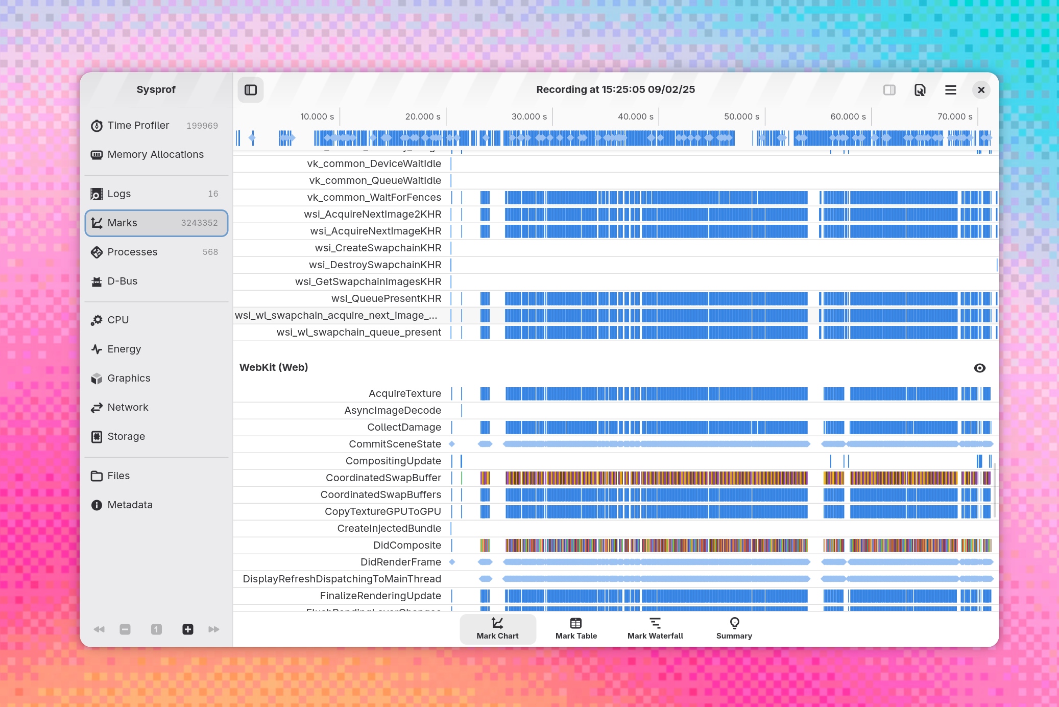
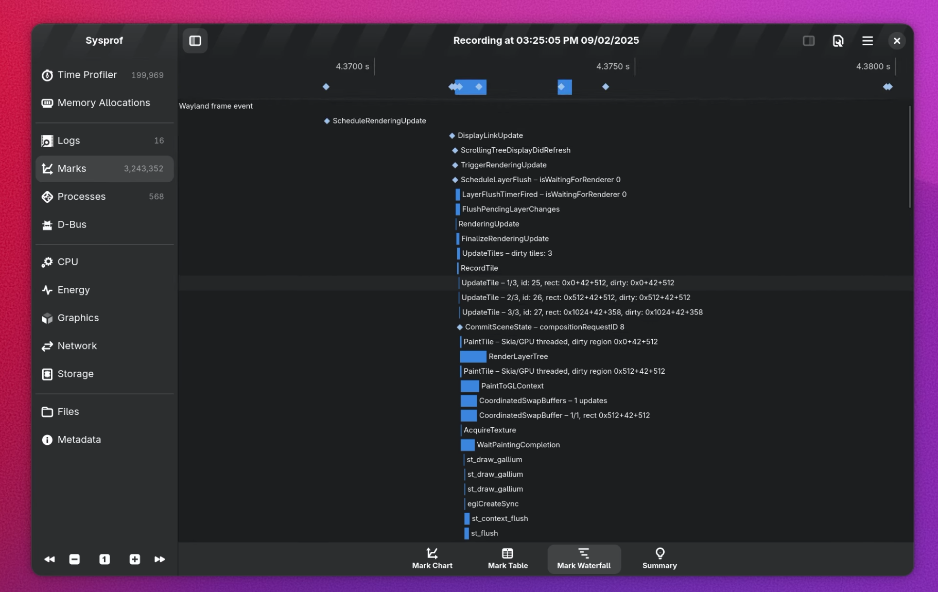
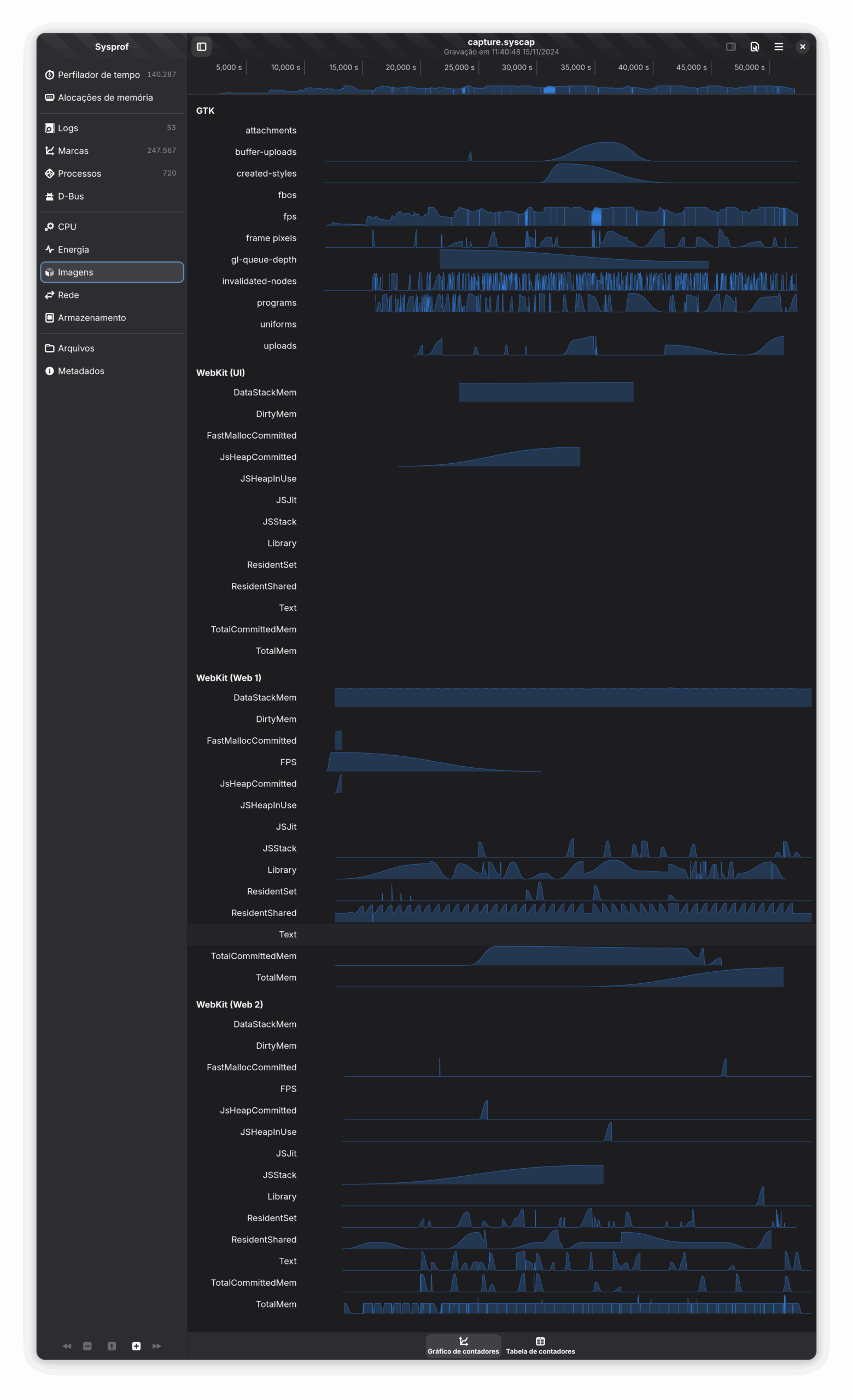
Sysprof received a round of improvements to the Marks Waterfall view, the hover tooltip now show the duration of the mark. The Graphics view also received some visual improvements, such as taller graphs and line rendering without cutoffs. Finally, Sysprof collector is now able to handle multiprocess scenarios better.

A new tool for Sysprof was added: sysprof-cat. It takes a capture file, and dumps it in textual form.

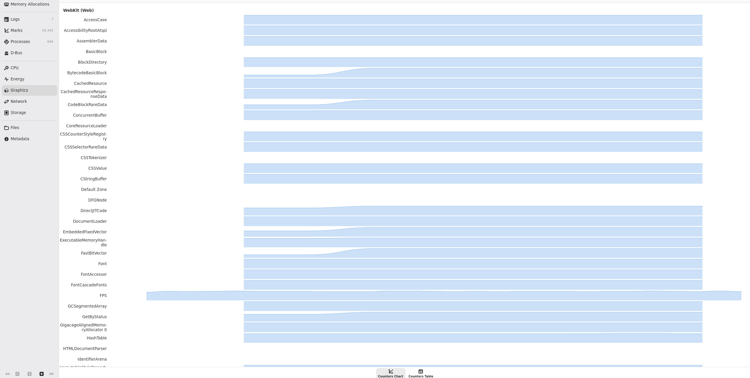
This is all in preparation to further profiler integration in WebKit on Linux. A new set of integration points is being prepared for WebKit where it can, for example, report the page FPS and memory usage to Sysprof in the Graphics view.

Sysprof user interface screenshot, showing the updated “Graphics” tab

The JSCOnly port may be built with support for the GLib main loop when configured with cmake -DPORT=JSCOnly -DEVENT_LOOP_TYPE=GLib. This is a seldom used option and the build was broken for months, but it has now been fixed.

This week the team took some time to kickstart improvements to the documentation. One of the goals we have had in mind for long is adding pages to the manual on a number of topics, and in this vein Georges has added an overview page for WebKitGTK and Alex started a page listing some of the available environment variables.

In order to allow sharing selected content between the GTK and WPE ports, Adrian is adding support to setup additional content directories for gi-docgen and to process templates to pick fragments of the source files depending on the port.

Improving what we already have is important, and Lauro has clarified how WebKitWebView::is-controlled-by-automation works.

Infrastructure 🏗️

We lately have been deploying nightly packaging bots, to provide binaries ready to use for different projects.

These bots run once per day and upload different built products that you can check below:

  1. GNOME Web Canary (built products):

    This one is meant to build GNOME Web with the GNOME SDK to produce the Canary builds of Web. Follow the progress at the corresponding Web merge request.

  2. WebKitGTK and WPE WebKit MiniBrowser/WebDriver universal bundles.

    These universal bundles should work on any Linux distribution and are intended for running tests on third-party CI systems without having to build WebKit. They include inside the tarball all the system libraries and resources needed to run WebKit, from libc up to the Mesa graphics drivers without requiring the usage of containers (similar concept to AppImage). Currently these builds are used to for the WPT tests at wpt.fyi, running on the Mozilla TaskCluster CI.

  3. JSC universal bundle (built products.

    Same content as the other universal bundles, but only including the jsc command line program. This is currently used by jsvu to easily allow developers to test the latest version of JavaScriptCore.

That’s all for this week!

By Unknown at November 15, 2024 11:10 PM

November 08, 2024

Igalia WebKit Team: WebKit Igalia Periodical #1

Igalia WebKit

Update on what happened in WebKit in the week from November 1 to November 8.

Cross-Port 🐱

The end-to-end latency slightly improved in the GstWebRTC backend, as the latency from capture devices is now properly taken into account.

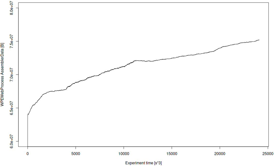
Georges has proposed a new feature for Linux ports of WebKit: support for a new category of profiling information called “counters”. Counters are useful to track information over time, for example, the FPS of WebKit while showing a web page, or how much memory a web page is consuming during its display. The counters are integrated with Sysprof.

This is another tool that developers and enthusiasts can use to help profile and improve the performance of WebKit on Linux. The FPS counter is added as a proof of concept. This is still under review.

The prefer-hardware WebCodecs option for video decoders is no longer ignored. It is used as a hint to attempt decoding with hardware-accelerated components. If that fails, the decoder falls back to software.

On the JSC ARMv7 front, work on enabling OMG, the highest WebAssembly optimizing JIT tier, is ongoing. Max Rottenkolber has added support for atomics. Justin Michaud has synced up the tail call code with 64-bits and submitted PRs to further sync the 64/32-bit OMG generators. Most importantly, he's been working on an OSR fix (On Stack Replacement, the ability for the VM to tier up to an optimizing tier even in the middle of a loop, which is vital for taking advantage of the optimized code). Angelos Oikonomopoulos has been going over corner cases in the B3 (the intermediate representation used by OMG) tests and submitting numerous fixes.

The minimum required ICU version is now 70.1. This change updates ICU version checked by CMake to reflect a change that had already been done in 284568@main, which rebaselined JavaScriptCore to ICU 70. By updating the version checks the build will fail as early as possible in case the required ICU version is not installed. In addition to ICU, the minimum versions of Harfbuzz and LibXML were updated too. These two libraries depend on ICU.

Philip fixed the --enable-write-console-messages-to-stdout setting so that it works inside AudioWorklet environments; previously it would have been ignored.

The MediaRecorder backend gained WebM support (which requires GStreamer 1.24.9 or newer), and audio bitrate configuration support.

WebKitGTK 🖥️

The GTK port of the MiniBrowser now uses the GtkGraphicsOffload widget when built with a modern GTK4 version. This allows GTK and the compositor to optimize the web view contents, potentially direct scanout it, or maybe put it in a monitor overlay plane as well. This should lead to less power consumption. This is an “invisible” improvement, meaning users won't be able to notice this.

WPE WebKit 📟

The WPE WebKit 2.47.1 development release is now available. This is the first preview release for the upcoming stable series, and includes a few new features like support for the Spiel speech synthesis library, improvements to DMA-BUF usage in WebGL and video decoding, and the WPEPlatform API has gotten some new features and improvements.

As usual, feedback for development releases is welcome, including issue reports on Bugzilla.

WPE Platform API 🧩

New, modern platform API that supersedes usage of libwpe and WPE backends.

Carlos Garcia added basic touch input support to WPEPlatform DRM plug-in.

Community & Events 🤝

Mario published an article based on the talk delivered at the WebKit Contributors meeting on October 22nd, summarizing the work on WebKit done at Igalia in the past twelve months: Igalia and WebKit: status update and plans.

The original slides are also available.

That’s all for this week!

By Unknown at November 08, 2024 11:25 PM

Release Notes for Safari Technology Preview 207

Surfin’ Safari

Safari Technology Preview Release 207 is now available for download for macOS Sequoia and macOS Sonoma. If you already have Safari Technology Preview installed, you can update it in System Settings under General → Software Update.

This release includes WebKit changes between: 284744@main…285486@main.

CSS

Resolved Issues

  • Fixed: Updated the shape() function to match the proposed syntax. (285442@main) (138126105)

Forms

New Features

  • Added enhancements to <input type=color> to support alpha and colorspace attributes. (285448@main) (137737348)

JavaScript

New Features

  • Added support for Atomics.pause. (284917@main) (137571229)

Resolved Issues

  • Fixed: Stopped using resolved scope as this value when calling functions. (284931@main) (77915872)
  • Fixed Set.prototype methods to invoke keys() without arguments. (284747@main) (137395979)
  • Fixed Array.from(), Array.fromAsync(), and TypedArray.from() to invoke document.all passed as a mapper. (284868@main) (137490201)
  • Fixed Intl.DurationFormat to have a value limit to match the specification. (285131@main) (137885273)
  • Fixed a rounding error for Intl.DurationFormat. (285482@main) (138261569)

Loading

New Features

  • Added noopener-allow-popups support in Cross-Origin-Opener-Policy. (284866@main) (129664445)

Networking

New Features

  • Added Brotli support for Compression Streams. (285391@main) (99159497)

Rendering

Resolved Issues

  • Fixed scriptlevel multipler for font-size in MathML. (285069@main) (137671252)
  • Fixed a flex container with no flex item to not run flex layout. (285129@main) (137884128)

Scrolling

Resolved Issues

  • Fixed changes to the “scrolling” attribute on an iframe element already in the DOM to take effect. (284947@main) (98911472)

Web Extensions

New Features

  • Added support for documentId to the sender message object. (284855@main) (137532821)
  • Added support for documentId to tabs.sendMessage() and tabs.connect(). (285438@main) (137532897)

Resolved Issues

  • Fixed tabs.executeScript ignoring the frameId parameter. (284915@main) (137449521) (FB15420092)

Web Inspector

Resolved Issues

  • Fixed: Changed the label to use “Disable site-specific quirks” in settings. (285136@main) (137779118)

November 08, 2024 04:30 PM

November 03, 2024

Mario Sanchez Prada: Igalia and WebKit: status update and plans (2024)

Igalia WebKit

It’s been more than 2 years since the last time I wrote something here, and in that time a lot of things happened. Among those, one of the main highlights was me moving back to Igalia‘s WebKit team, but this time I moved as part of Igalia’s support infrastructure to help with other types of tasks such as general coordination, team facilitation and project management, among other things.

On top of those things, I’ve been also presenting our work around WebKit in different venues, such as in the Embedded Open Source Summit or in the Embedded Recipes conference, for instance. Of course, that included presenting our work in the WebKit community as part of the WebKit Contributors Meeting, a small and technically focused event that happens every year, normally around the Bay Area (California). That’s often a pretty dense presentation where, over the course of 30-40 minutes, we go through all the main areas that we at Igalia contribute to in WebKit, trying to summarize our main contributions in the previous 12 months. This includes work not just from the WebKit team, but also from other ones such as our Web Platform, Compilers or Multimedia teams.

So far I did that a couple of times only, both last year on October 24rth as well as this year, just a couple of weeks ago in the latest instance of the WebKit Contributors meeting. I believe the session was interesting and informative, but unfortunately it does not get recorded so this time I thought I’d write a blog post to make it more widely accessible to people not attending that event.

This is a long read, so maybe grab a cup of your favorite beverage first…

Igalia and WebKit

So first of all, what is the relationship between Igalia and the WebKit project?

In a nutshell, we are the lead developers and the maintainers of the two Linux-based WebKit ports, known as WebKitGTK and WPE. These ports share a common baseline (e.g. GLib, GStreamer, libsoup) and also some goals (e.g. performance, security), but other than that their purpose is different, with WebKitGTK being aimed at the Linux desktop, while WPE is mainly focused on embedded devices.

This means that, while WebKitGTK is the go-to solution to embed Web content in GTK applications (e.g. GNOME Web/Epiphany, Evolution), and therefore integrates well with that graphical toolkit, WPE does not even provide a graphical toolkit since its main goal is to be able to run well on embedded devices that often don’t even have a lot of memory or processing power, or not even the usual mechanisms for I/O that we are used to in desktop computers. This is why WPE’s architecture is designed with flexibility in mind with a backends-based architecture, why it aims for using as few resources as possible, and why it tries to depend on as few libraries as possible, so you can integrate it virtually in any kind of embedded Linux platform.

Besides that port-specific work, which is what our WebKit and Multimedia teams focus a lot of their effort on, we also contribute at a different level in the port-agnostic parts of WebKit, mostly around the area of Web standards (e.g. contributing to Web specifications and to implement them) and the Javascript engine. This work is carried out by our Web Platform and Compilers team, which tirelessly contribute to the different parts of WebCore and JavaScriptCore that affect not just the WebKitGTK and WPE ports, but also the rest of them to a bigger or smaller degree.

Last but not least, we also devote a considerable amount of our time to other topics such as accessibility, performance, bug fixing, QA... and also to make sure WebKit works well on 32-bit devices, which is an important thing for a lot of WPE users out there.

Who are our users?

At Igalia we distinguish 4 main types of users of the WebKitGTK and WPE ports of WebKit:

Port users: this category would include anyone that writes a product directly against the port’s API, that is, apps such as a desktop Web browser or embedded systems that rely on a fullscreen Web view to render its Web-based content (e.g. digital signage systems).

Platform providers: in this category we would have developers that build frameworks with one of the Linux ports at its core, so that people relying on such frameworks can leverage the power of the Web without having to directly interface with the port’s API. RDK could be a good example of this use case, with WPE at the core of the so-called Thunder plugin (previously known as WPEFramework).

Web developers: of course, Web developers willing to develop and test their applications against our ports need to be considered here too, as they come with a different set of needs that need to be fulfilled, beyond rendering their Web content (e.g. using the Web Inspector).

End users: And finally, the end user is the last piece of the puzzle we need to pay attention to, as that’s what makes all this effort a task worth undertaking, even if most of them most likely don’t need what WebKit is, which is perfectly fine :-)

We like to make this distinction of 4 possible types of users explicit because we think it’s important to understand the complexity of the amount of use cases and the diversity of potential users and customers we need to provide service for, which is behind our decisions and the way we prioritize our work.

Strategic goals

Our main goal is that our product, the WebKit web engine, is useful for more and more people in different situations. Because of this, it is important that the platform is homogeneous and that it can be used reliably with all the engines available nowadays, and this is why compatibility and interoperability is a must, and why we work with the the standards bodies to help with the design and implementation of several Web specifications.

With WPE, it is very important to be able to run the engine in small embedded devices, and that requires good performance and being efficient in multiple hardware architectures, as well as great flexibility for specific hardware, which is why we provided WPE with a backend-based architecture, and reduced dependencies to a minimum.

Then, it is also important that the QA Infrastructure is good enough to keep the releases working and with good quality, which is why I regularly maintain, evolve and keep an eye on the EWS and post-commit bots that keep WebKitGTK and WPE building, running and passing the tens of thousands of tests that we need to check continuously, to ensure we don’t regress (or that we catch issues soon enough, when there’s a problem). Then of course it’s also important to keep doing security releases, making sure that we release stable versions with fixes to the different CVEs reported as soon as possible.

Finally, we also make sure that we keep evolving our tooling as much as possible (see for instance the release of the new SDK earlier this year), as well as improving the documentation for both ports.

Last, all this effort would not be possible if not because we also consider a goal of us to maintain an efficient collaboration with the rest of the WebKit community in different ways, from making sure we re-use and contribute to other ports as much code as possible, to making sure we communicate well in all the forums available (e.g. Slack, mailing list, annual meeting).

Contributions to WebKit in numbers

Well, first of all the usual disclaimer: number of commits is for sure not the best possible metric,  and therefore should be taken with a grain of salt. However, the point here is not to focus too much on the actual numbers but on the more general conclusions that can be extracted from them, and from that point of view I believe it’s interesting to take a look at this data at least once a year.

With that out of the way, it’s interesting to confirm that once again we are still the 2nd biggest contributor to WebKit after Apple, with ~13% of the commits landed in this past 12-month period. More specifically, we landed 2027 patches out of the 15617 ones that took place during the past year, only surpassed by Apple and their 12456 commits. The remaining 1134 patches were landed mostly by Sony, followed by RedHat and several other contributors.

Now, if we remove Apple from the picture, we can observe how this year our contributions represented ~64% of all the non-Apple commits, a figure that grew about ~11% compared to the past year. This confirms once again our commitment to WebKit, a project we started contributing about 14 years ago already, and where we have been systematically being the 2nd top contributor for a while now.

Main areas of work

The 10 main areas we have contributed to in WebKit in the past 12 months are the following ones:

  • Web platform
  • Graphics
  • Multimedia
  • JavaScriptCore
  • New WPE API
  • WebKit on Android
  • Quality assurance
  • Security
  • Tooling
  • Documentation

In the next sections I’ll talk a bit about what we’ve done and what we’re planning to do next for each of them.

Web Platform

content-visibility:auto

This feature allows skipping painting and rendering of off-screen sections, particularly useful to avoid the browser spending time rendering parts in large pages, as content outside of the view doesn’t get rendered until it gets visible.

We completed the implementation and it’s now enabled by default.

Navigation API

This is a new API to manage browser navigation actions and examine history, which we started working on in the past cycle. There’s been a lot of work happening here and, while it’s not finished yet, the current plan is that Apple will continue working on that in the next months.

hasUAVisualTransition

This is an attribute of the NavigateEvent interface, which is meant to be True if the User Agent has performed a visual transition before a navigation event. It was something that we have also finished implementing and is now also enabled by default.

Secure Curves in the Web Cryptography API

In this case, we worked on fixing several Web Interop related issues, as well as on increasing test coverage within the Web Platform Tests (WPT) test suites.

On top of that we also moved the X25519 feature to the “prepare to ship” stage.

Trusted Types

This work is related to reducing DOM-based XSS attacks. Here we finished the implementation and this is now pending to be enabled by default.

MathML

We continued working on the MathML specification by working on the support for padding, border and margin, as well as by increasing the WPT score by ~5%.

The plan for next year is to continue working on core features and improve the interaction with CSS.

Cross-root ARIA

Web components have accessibility-related issues with native Shadow DOM as you cannot reference elements with ARIA attributes across boundaries. We haven’t worked on this in this period, but the plan is to work in the next months on implementing the Reference Target proposal to solve those issues.

Canvas Formatted Text

Canvas has not a solution to add formatted and multi-line text, so we would like to also work on exploring and prototyping the Canvas Place Element proposal in WebKit, which allows better text in canvas and more extended features.

Graphics

Completed migration from Cairo to Skia for the Linux ports

If you have followed the latest developments, you probably already know that the Linux WebKit ports (i.e. WebKitGTK and WPE) have moved from Cairo to Skia for their 2D rendering library, which was a pretty big and important decision taken after a long time trying different approaches and experiments (including developing our own HW-accelerated 2D rendering library!), as well as running several tests and measuring results in different benchmarks.

The results in the end were pretty overwhelming and we decided to give Skia a go, and we are happy to say that, as of today, the migration has been completed: we covered all the use cases in Cairo, achieving feature parity, and we are now working on implementing new features and improvements built on top of Skia (e.g. GPU-based 2D rendering).

On top of that, Skia is now the default backend for WebKitGTK and WPE since 2.46.0, released on September 17th, so if you’re building a recent version of those ports you’ll be already using Skia as their 2D rendering backend. Note that Skia is using its GPU-based backend only on desktop environments, on embedded devices the situation is trickier and for now the default is the CPU-based Skia backend, but we are actively working to narrow the gap and to enable GPU-based rendering also on embedded.

Architecture changes with buffer sharing APIs (DMABuf)

We did a lot of work here, such as a big refactoring of the fencing system to control the access to the buffers, or the continued work towards integrating with Apple’s DisplayLink infrastructure.

On top of that, we also enabled more efficient composition using damaging information, so that we don’t need to pass that much information to the compositor, which would slow the CPU down.

Enablement of the GPUProcess

On this front, we enabled by default the compilation for WebGL rendering using the GPU process, and we are currently working in performance review and enabling it for other types of rendering.

New SVG engine (LBSE: Layer-Based SVG Engine)

If you are not familiar with this, here the idea is to make sure that we reuse the graphics pipeline used for HTML and CSS rendering, and use it also for SVG, instead of having its own pipeline. This means, among other things, that SVG layers will be supported as a 1st-class citizen in the engine, enabling HW-accelerated animations, as well as support for 3D transformations for individual SVG elements.

On this front, on this cycle we added support for the missing features in the LBSE, namely:

  • Implemented support for gradients & patterns (applicable to both fill and stroke)
  • Implemented support for clipping & masking (for all shapes/text)
  • Implemented support for markers
  • Helped review implementation of SVG filters (done by Apple)

Besides all this, we also improved the performance of the new layer-based engine by reducing repaints and re-layouts as much as possible (further optimizations still possible), narrowing the performance gap with the current engine for MotionMark. While we are still not at the same level of performance as the current SVG engine, we are confident that there are several key places where, with the right funding, we should be able to improve the performance to at least match the current engine, and therefore be able to push the new engine through the finish line.

General overhaul of the graphics pipeline, touching different areas (WIP):

On top of everything else commented above, we also worked on a general refactor and simplification of the graphics pipeline. For instance, we have been working on the removal of the Nicosia layer now that we are not planning to have multiple rendering implementations, among other things.

Multimedia

DMABuf-based sink for HW-accelerated video

We merged the DMABuf-based sink for HW-accelerated video in the GL-based GStreamer sink.

WebCodecs backend

We completed the implementation of  audio/video encoding and decoding, and this is now enabled by default in 2.46. As for the next steps, we plan to keep working on the integration of WebCodecs with WebGL and WebAudio.

GStreamer-based WebRTC backends

We continued working on GstWebRTC, bringing it to a point where it can be used in production in some specific use cases, and we will still be working on this in the next months.

Other

Besides the points above, we also added an optional text-to-speech backend based on libspiel to the development branch, and worked on general maintenance around the support for Media Source Extensions (MSE) and Encrypted Media Extensions (EME), which are crucial for the use case of WPE running in set-top-boxes, and is a permanent task we will continue to work on in the next months.

JavaScriptCore

ARMv7/32-bit support:

A lot of work happened around 32-bit support in JavaScriptCore, especially around WebAssembly (WASM): we ported the WASM BBQJIT and ported/enabled concurrent JIT support, and we also completed 80% of the implementation for the OMG optimization level of WASM, which we plan to finish in the next months. If you are unfamiliar with what the OMG and BBQ optimization tiers in WASM are, I’d recommend you to take a look at this article in webkit.org: Assembling WebAssembly.

We also contributed to the JIT-less WASM, which is very useful for embedded systems that can’t support JIT for security or memory related constraints, and also did some work on the In-Place Interpreter (IPInt), which is a new version of the WASM Low-level interpreter (LLInt) that uses less memory and executes WASM bytecode directly without translating it to LLInt bytecode  (and should therefore be faster to execute).

Last, we also contributed most of the implementation for the WASM GC, with the exception of some Kotlin tests.

As for the next few months, we plan to investigate and optimize heap/JIT memory usage in 32-bit, as well as to finish several other improvements on ARMv7 (e.g. IPInt).

New WPE API

The new WPE API is a new API that aims at making it easier to use WPE in embedded devices, by removing the hassle of having to handle several libraries in tandem (i.e. WPEWebKit, libWPE and WPEBackend-FDO, for instance), available from WPE’s releases page, and providing a more modern API in general, better aimed at the most common use cases of WPE.

A lot of effort happened this year along these lines, including the fact that we finally upstreamed and shipped its initial implementation with WPE 2.44, back in the first half of the year. Now, while we recommend users to give it a try and report feedback as much as possible, this new API is still not set in stone, with regular development still ongoing, so if you have the chance to try it out and share your experience, comments are welcome!

Besides shipping its initial implementation, we also added support for external platforms, so that other ones can be loaded beyond the Wayland, DRM and “headless” ones, which are the default platforms already included with WPE itself. This means for instance that a GTK4 platform, or another one for RDK could be easily used with WPE.

Then of course a lot of API additions were included in the new API in the latest months:

  • Screens management APIAPI to handle different screens, ask the display for the list of screens with their device scale factor, refresh rate, geometry…
  • Top level management API: This API allows a greater degree of control, for instance by allowing more than one WebView for the same top level, as well as allowing to retrieve properties such as size, scale or state (i.e. full screen, maximized…).
  • Maximized and minimized windows API: API to maximize/minimize a top level and monitor its state. mainly used by WebDriver.
  • Preferred DMA-BUF formats API: enables asking the platform (compositor or DRM) for the list of preferred formats and their intended use (scanout/rendering).
  • Input methods APIallows platforms to provide an implementation to handle input events (e.g. virtual keyboard, autocompletion, auto correction…).
  • Gestures API: API to handle gestures (e.g. tap, drag).
  • Buffer damaging: WebKit generates information about the areas of the buffer that actually changed and we pass that to DRM or the compositor to optimize painting.
  • Pointer lock API: allows the WebView to lock the pointer so that the movement of the pointing device (e.g. mouse) can be used for a different purpose (e.g. first-person shooters).

Last, we also added support for testing automation, and we can support WebDriver now in the new API.

With all this done so far, the plan now is to complete the new WPE API, with a focus on the Settings API and accessibility support, write API tests and documentation, and then also add an external platform to support GTK4. This is done on a best-effort basis, so there’s no specific release date.

WebKit on Android

This year was also a good year for WebKit on Android, also known as WPE Android, as this is a project that sits on top of WPE and its public API (instead of developing a fully-fledged WebKit port).

In case you’re not familiar with this, the idea here is to provide a WebKit-based alternative to the Chromium-based Web view on Android devices, in a way that leverages HW acceleration when possible and that it integrates natively (and nicely) with the several Android subsystems, and of course with Android’s native mainloop. Note that this is an experimental project for now, so don’t expect production-ready quality quite yet, but hopefully something that can be used to start experimenting with selected use cases.

If you’re adventurous enough, you can already try the APKs yourself from the releases page in GitHub at https://github.com/Igalia/wpe-android/releases.

Anyway, as for the changes that happened in the past 12 months, here is a summary:

  • Updated WPE Android to WPE 2.46 and NDK 27 LTS
  • Added support for WebDriver and included WPT test suites
  • Added support for instrumentation tests, and integrated with the GitHub CI
  • Added support for the remote Web inspector, very useful for debugging
  • Enabled the Skia backend, bringing HW-accelerated 2D rendering to WebKit on Android
  • Implemented prompt delegates, allowing implementing things such as alert dialogs
  • Implemented WPEView client interfaces, allowing responding to things such as HTTP errors
  • Packaged a WPE-based Android WebView in its own library and published in Maven Central. This is a massive improvement as now apps can use WPE Android by simply referencing the library from the gradle files, no need to build everything on their own.
  • Other changes: enabled HTTP/2 support (via the migration to libsoup3), added support for the device scale factor, improved the virtual on-screen keyboard, general bug fixing…

On top of that, we published 3 different blog posts covering different topics, from a general intro to a more deep dive explanation of the internals, and showing some demos. You can check them out in Jani’s blog at https://blogs.igalia.com/jani

As for the future, we’ll focus on stabilization and regular maintenance for now, and then we’d like to work towards achieving production-ready quality for specific cases if possible.

Quality Assurance

On the QA front, we had a busy year but in general we could highlight the following topics.

  • Fixed a lot of API tests failures in the bots that were limiting our test coverage.
  • Fixed lots of assertions-related crashes in the bots, which were slowing down the bots as well as causing other types of issues, such as bots exiting early due too many failures.
  • Enabled assertions in the release bots, which will help prevent crashes in the future, as well as with making our debug bots healthier.
  • Moved all the WebKitGTK and WPE bots to building now with Skia instead of Cairo. This means that all the bots running tests are now using Skia, and there’s only one bot still using Cairo to make sure that the compilation is not broken, but that bot does not run tests.
  • Moved all the WebKitGTK bots to use GTK4 by default. As with the move to Skia, all the WebKit bots running tests now use GTK4 and the only one remaining building with GTK3 does not run tests, it only makes sure we don’t break the GTK3 compilation for now.
  • Working on moving all the bots to use the new SDK. This is still work in progress and will likely be completed during 2025 as it’s needed to implement several changes in the infrastructure that will take some time.
  • General gardening and bot maintenance

In the next months, our main focus would be a revamp of the QA infrastructure to make sure that we can get all the bots (including the debug ones) to a healthier state, finish the migration of all the bots to the new SDK and, ideally, be able to bring back the ready-to-use WPE images that we used to have available in wpewebkit.org.

Security

The current release cadence has been working well, so we continue issuing major releases every 6 months (March, September), and then minor and unstable development releases happening on-demand when needed.

As usual, we kept aligning releases for WebKitGTK and WPE, with both of them happening at the same time (see https://webkitgtk.org/releases and https://wpewebkit.org/release), and then also publishing WebKit Security Advisories (WSA) when necessary, both for WebKitGTK and for WPE.

Last, we also shortened the time before including security fixes in stable releases this year, and we have removed support for libsoup2 from WPE, as that library is no longer maintained.

Tooling & Documentation

On tooling, the main piece of news is that this year we released the initial version of the new SDK,  which is developed on top of OCI-based containers. This new SDK fixes the issues with the current existing approaches based on JHBuild and flatpak, where one of them was great for development but poor for testing and QA, and the other one was great for testing and QA, but not very convenient for development.

This new SDK is regularly maintained and currently runs on Ubuntu 24.04 LTS with GCC 14 & Clang 18. It has been made public on GitHub and announced to the public in May 2024 in Patrick’s blog, and is now the officially recommended way of building WebKitGTK and WPE.

As for documentation, we didn’t do as much as we would have liked here, but we still landed a few contributions in docs.webkit.org, mostly related to WebKitGTK (e.g. Releases and VersioningSecurity UpdatesMultimedia). We plan to do more on this regard in the next months, though, mostly by writing/publishing more documentation and perhaps also some tutorials.

Final thoughts

This has been a fairly long blog post but, as you can see, it’s been quite a year for WebKit here at Igalia, with many exciting changes happening at several fronts, and so there was quite a lot of stuff to comment on here. This said, you can always check the slides of the presentation in the WebKit Contributors Meeting here if you prefer a more concise version of the same content.

In any case, what’s clear it’s that the next months are probably going to be quite interesting as well with all the work that’s already going on in WebKit and its Linux ports, so it’s possible that in 12 months from now I might be writing an equally long essay. We’ll see.

Thanks for reading!

By mario at November 03, 2024 05:20 PM

October 28, 2024

WebKit Features in Safari 18.1

Surfin’ Safari

Today, Safari 18.1 is available for iOS 18.1, iPadOS 18.1, macOS Sequoia 15.1 and visionOS 2.1, as well as macOS Sonoma and macOS Ventura. Two features are newly available with Apple Intelligence, on devices and in languages where available.

Summaries in Reader

Since 2010, Safari Reader has provided an easy way to view articles on the web without navigation or other distractions — formatted for easy reading and presented all on one page. You can adjust the background color, font, and font size. Safari 18.0 brought a refreshed design to Reader, making it even easier to use.

iPhone showing an article in Safari Reader, with a summary describing this article about CSS Masonry and choosing syntax.

Now in Safari Reader in Safari 18.1, you can tap Summarize to use Apple Intelligence to summarize the article. Longer pages include table of contents. Safari also offers summary highlights for some articles in the Page Menu on macOS, iOS and iPadOS.

Writing Tools

These days, we do a lot of writing on the web. With Apple Intelligence, Safari 18.1 can help you find just the right words. Writing Tools can proofread your text, or rewrite different versions until the tone and wording are just right. And it can summarize selected text with a tap.

A paragraph of text in a web-based text editor, highlighted, with Writing Tools showing in a popover next to the paragraph. Writing Tools include: Proofread; Rewrite; make more Friendly, Professional, Concise; Summary, Key Points, List, Table.

WebKit also adds support for the Writing Tools API in WKWebView for enabling and customizing the behavior of Writing Tools in apps built with web technology. Learn more watching Get started with Writing Tools.

For more information about the availability of Apple Intelligence, see apple.com.

Bug Fixes and more

In addition to all the new features, WebKit for Safari 18.1 includes work to polish existing features, including some that help Safari pass even more tests for Interop 2024.

Accessibility

  • Fixed display: contents on tbody elements preventing table rows from being properly exposed in the accessibility tree.
  • Fixed the handling of ElementInternals‘s ariaValueNow null values so the right value is exposed to assistive technologies.
  • Fixed tables with hidden rows reporting wrong counts and blocking access to some rows in VoiceOver.
  • Fixed role="menu" elements to allow child groups with menuitem children.
  • Fixed updating the accessibility tree when text underneath an aria-describedby element changes.
  • Fixed text exposed to assistive technologies when display: contents directly wraps a display: block text container.
  • Fixed VoiceOver not finding any content in a table when display: table is applied to tbody elements.

Authentication

  • Fixed an issue using large credential lists with security keys.

CSS

  • Fixed style container queries querying the root element.

Editing

  • Fixed deleting content immediately before a <picture> element unexpectedly removing <source> elements.
  • Fixed inserting text before a <picture> element inserting the text after the element instead.

JavaScript

  • Fixed incorrect optimization and random non-updated values.

Media

  • Fixed a bug in WebCodecs where audio and video codecs with pending work could be prematurely garbage collected.

Networking

  • Fixed a bug where Cross-Origin-Opener-Policy header fields in the response of iframe elements were not ignored, resulting in window.opener being null after multiple cross-origin navigations of the embedder document.

Rendering

  • Fixed content-visibility to not apply to elements with display: contents or display: none.
  • Fixed float clearing in the WordPress Classic Editor sidebar layout.

Security

  • Fixed the ping attribute for <a> elements to be controlled by the connect-src CSP directive.

Web Extensions

  • Fixed blob: URL downloads failing to trigger from an extension.

WebRTC

  • Fixed blurry screen sharing for some sites.

WKWebView

  • Fixed AVIF in WKWebView on macOS. (FB14678252)

Updating to Safari 18.1

Safari 18.1 is available on iOS 18.1, iPadOS 18.1, macOS Sequoia, macOS Sonoma, macOS Ventura, and in visionOS 2.1.

If you are running macOS Sonoma or macOS Ventura, you can update Safari by itself, without updating macOS. Go to  > System Settings > General > Software Update and click “More info…” under Updates Available.

To get the latest version of Safari on iPhone, iPad or Apple Vision Pro, go to Settings > General > Software Update, and tap to update.

Feedback

We love hearing from you. To share your thoughts, find us on Mastodon at @jensimmons@front-end.social and @jondavis@mastodon.social. Or send a reply on X to @webkit. You can also follow WebKit on LinkedIn. If you run into any issues, we welcome your feedback on Safari UI (learn more about filing Feedback), or your WebKit bug report about web technologies or Web Inspector. If you run into a website that isn’t working as expected, please file a report at webcompat.com. Filing issues really does make a difference.

Download the latest Safari Technology Preview on macOS to stay at the forefront of the web platform and to use the latest Web Inspector features.

You can also find this information in the Safari 18.1 release notes.

October 28, 2024 04:30 PM

October 23, 2024

Release Notes for Safari Technology Preview 206

Surfin’ Safari

Safari Technology Preview Release 206 is now available for download for macOS Sequoia beta and macOS Sonoma. If you already have Safari Technology Preview installed, you can update it in System Settings under General → Software Update.

This release includes WebKit changes between: 284050@main…284743@main.

CSS

Resolved Issues

  • Fixed: Dropped layout containment from container-type. (284730@main) (132549134)
  • Fixed CSS nested declarations inside a @scope to behave like :where(:scope). (284635@main) (136856371)

Editing

New Features

  • Implemented ClipboardItem.support() which gives the page author the ability to understand which formats are supported during Clipboard operations. It also now returns a TypeError for a new ClipboardItem() with an empty Array. (284593@main) (136008522)

Resolved Issues

  • Fixed missing SecureContext in the ClipboardItem interface. (284511@main) (137197266)

JavaScript

New Features

Resolved Issues

  • Fixed Iterator.prototype.reduce() not properly forwarding the return() call to the underlying iterator. (284648@main) (137181340)

Media

New Features

Rendering

Resolved Issues

  • Fixed non-separable blend modes in mix-blend-mode to workon elements in compositing layers. (284170@main) (49387130)
  • Fixed repeating background-image sized to the content-box failing to fill the viewport in an iframe. (284165@main) (133952319)
  • Fixed floats not clearing in the WordPress Classic Editor sidebar layout. (284247@main) (136362683)

SVG

Resolved Issues

  • Fixed: Updated getTotalLength() with the web specification to throw an exception when non-renderable and the path is empty. (284311@main) (136719548)

Tables

Resolved Issues

  • Fixed Table Root to also account for fill-available in a fixed table layout. (284712@main) (137297914)

Web Extensions

New Features

  • Added support for getKeys() in storage areas. (284602@main) (136595295)
  • Added support for i18n.getSystemUILanguage and i18n.getPreferredSystemLanguages. (284637@main) (136929657)

WebDriver

Resolved Issues

  • Fixed a crash that could occur when simulating drag events with the right mouse button. (284577@main) (137068514)

WebRTC

New Features

  • Added support for enumerated visible network interfaces. (284687@main) (137067672)

Resolved Issues

  • Fixed MediaSession.setMicrophoneActive(true) prompting repeatedly if the microphone was muted by the user-agent once. (284399@main) (135941062)

  • FixedsetCameraActive to not unmute microphone if the user-agent previously muted both camera and microphone. (284069@main) (136221456)

  • Fixed AirPods unmuting to not unmute the camera if website muted the camera. (284514@main) (137065964)

October 23, 2024 09:31 PM

October 21, 2024

Help us choose the final syntax for Masonry in CSS

Surfin’ Safari

Back in April 2024, we wrote about “Masonry” layout in CSS and the ongoing work to bring this feature to browsers. In it, we described a debate about whether or not the full power of CSS Grid (subgrid, spanning, explicit placement, and all the options for track sizing) should be combined with the packed layout currently accomplished with tools like masonry.js. Some believed that the full complexity wasn’t necessary, or even practical to implement, and that a simpler feature focused on solving the classic Masonry use case would be better. There were very practical performance concerns about the feasibility of integrating with the full power and flexibility of Grid track sizing. Could browser engines handle Grid + Masonry while remaining lightning fast?

We asked you to help us by joining the debate. Thanks to everyone who shared their thoughts, use cases, diagrams, and demos. Your feedback is valuable and helps us move the conversation forward.

Over the last six months, the key performance concerns have been addressed. Yes, it is possible to integrate Masonry layout with the full power of CSS Grid. Our engineers at Apple have been hard at work collaborating with our colleagues at Google and the CSS Working Group (CSSWG) to go through all the details.

Demo of simply masonry-style layout, with numbers showing the order of items in the layout. Also, a header on the page shows the code used to make this layout, along with controls to try other variations.
Our April 2024 article on Grid level 3 includes walkthroughs of four demos with 23 variations. Try them out in Safari Technology Preview, in Safari 17.x or 18.x (after checking “CSS Masonry Layout” at Develop > Feature Flags), or in Firefox 77+ (after enabling its flag).

Once we’d proven that it is possible — and with your help, that it is a good idea to infuse this new feature with the full power of Grid — the CSSWG resolved to adopt mixed track-sizing for masonry-style layouts in September. It’s a fantastic milestone! With this consensus, the CSSWG published a First Public Working Draft of CSS Grid Layout Module Level 3.

The remaining debate over syntax

At this point, there’s one major question remaining — what should the syntax be? Currently, the specification is drafted with two options, going head-to-head — the “Grid Integrated” option and the “Grid Independent” option. (To make it clearer which is which, we’re going to call them the “Just Use Grid” option and the “New Masonry Layout” option throughout this article.)

The syntactical decision depends on how we conceive of this feature and its future. Is this an extension of CSS Grid, leveraging existing Grid properties? Or should it be treated as something completely different, with its own set of new properties and new default values? You’ll be able to code the same layouts either way. The functionality will be the same.

Recently folks from Chrome wrote an article about their perspective:

The Chrome team still believes that a separate masonry syntax would be the best way to proceed. While the biggest performance issue mentioned in our previous post is resolved, there are still concerns around syntax, initial values, and how easy a version combined with grid would be to learn.

Rachel Andrew added additional arguments in her blog post in favor of the New Masonry Layout option:

My opinion is, as it was in 2020, that defining masonry as part of grid would be a mistake… Good defaults make things easier to teach… good defaults mean less configuration.

Their argument is that developers won’t have to write as much code as they would if this feature becomes part of CSS Grid. By resetting the formatting context, the all-new properties can have new default values more suited for Masonry layouts, making it faster and easier, especially when coding the kind of classic Masonry layout made popular by Pinterest. You won’t have to override the defaults invented for CSS Grid.

The article from the Chrome team lists many side-by-side examples to prove their point. Here’s the first one, defining a symmetrical 3-column masonry layout in each syntax:

New Masonry Layout

.masonry {
  display: masonry;
  masonry-template-tracks: repeat(3, 1fr);
  gap: 10px;
}

Just Use Grid

.masonry {
  display: grid;
  grid-template-columns: repeat(3, 1fr);
  grid-template-rows: masonry; /* final name TBD */
  gap: 10px;
}
(We also believe that the value masonry should be renamed. See Footnote 1.)

In all of their examples, the New Masonry Layout option does use one fewer line of code (or shorthands that require fewer values). And being able to write fewer lines of code is a valuable quality.

Plus, perhaps imagining this new feature as display: masonry just feels, well, neater. It clicks into a simple story about layout on the web: “You’ve got several options: flow, multicolumn, grid, flex, and masonry. Pick which one you want, and use it.” It’s totally understandable why for many people, that can seem like the best route forward.

When you look at isolated examples like this, with two alternative realities pitted head to head — especially if you have not learned CSS Grid yet — the New Masonry Layout option may look nicer, cleaner, easier to guess what it’s doing.

But, a real CSS file is never five lines of code. Real life is far more complicated. You might want to code a classic Grid layout up to a breakpoint, and then switch to a masonry-style layout on wider (or narrower) screens. In that case, switching layouts would require more lines of code with the New Masonry Layout option compared to the Just Use Grid option.

The WebKit team at Apple still strongly believes that separating CSS Grid and masonry-style packed layouts into two separate layout mechanisms would be a mistake. We believe that looking at simplistic code examples in isolation might not be the best way to evaluate this decision. We perceive all of this functionality as part of one layout system that would be best served by united syntax. In this article, we’ll go into why.

Design Principles

Whenever there are tough disagreements like this one, the best way to move forward is to look at the 30,000 foot view — to discuss the larger implications of the choices available. How does a W3C Working Group do this? By relying on design principles. CSS is a programming language that’s evolved over 30 years. Throughout, it’s been guided by design principles. The CSS Working Group doesn’t have official Design Principles documented the way HTML does. But in 2003, Bert Bos, co-inventor of CSS, wrote down his ideas for what makes a good web standard.

These principles include:

  • Simplicity: Good programming languages have simple, understandable models and syntax. They are both easy to use and powerful enough to directly express developer intent. Languages that are complicated, or whose practical use is convoluted, are hard to understand and use correctly.
  • Learnability: Web technology should be easy for developers to learn. It should be readable without being verbose; re-use familiar syntax for familiar concepts; and, in general, be designed for humans over computers.
  • Minimum Redundancy: “The overlap in functionality between different specifications should be kept small, because it can easily lead to incompatible models.” While some redundancy in functionality can help developers express logic more clearly, incompatible models make technology harder to implement, and are more likely to result in errors.
  • Repurposing: “Adaptation of some existing piece of data for a new purpose” is a core function of the design of the web. The HTML Design Principles calls this “Do not Reinvent the Wheel”. Extend an existing technology instead of inventing something new for the same or similar purpose.
  • Use What Is There: An existing API might not be ideal. Maybe you wish we could go back and start over. But we can’t. Use what’s there, and forge the best path forward. “Throwing away software that works, although imperfectly, and teaching everybody something new would be a huge waste of resources.”
  • Extensibility: CSS is designed to be extended — its parsing and interpretation rules, its general syntax, and even the specific syntax of its properties and their values — they are all intentionally designed to accommodate future extensions to CSS. It allows for progressive enhancement of an existing page in newer browsers, and for graceful degradation of a newer page in older browsers.
  • Design by committee: “Specifications are created by a committee rather than by a single individual… more pairs of eyes mean more checking for errors, more creativity in finding solutions to problems, and more experience in knowing what worked or didn’t work in the past.”

In other words, reuse as much as possible of the language that already exists, repurposing things as you go. Keep things as simple as possible. Make it easy to learn. Don’t be redundant in creating more than one way to do things. And have debates like this one in order to find the best solution!

Let’s look at how these design principles apply to the syntactical decision at hand.

Simplicity | Learnability

The case the folks on the Chrome team are making could be seen as seeking simplicity. As a developer, if you can accomplish a layout in one less line of code, isn’t that simpler? And if you can just use the defaults for the new Masonry properties, instead of needing to override them, surely that’s simpler. Less code. Better defaults. Easier to learn. Right?

We believe making Masonry a separate display type only seems simpler in isolation: reading snippets of code in a blog post, focusing on a head-to-head battle. But Masonry is not going to live in isolation. We already have CSS Grid.

Let’s see if we can understand how a unified system for layout feels. What’s it like to have CSS Grid with this addition of new functionality?

Layout of 16 photos — all squares, in a 4 by 4 grid.A layout of 16 photos, of all different aspect ratios, packed into 4 columns, in a masonry-style layout.

To lay out the square images seen on the left, you can write:

main {
  display: grid;
  grid-template-columns: repeat(auto-fit, minmax(14rem, 1fr));
  grid-template-rows: auto; /* default value, unnecessary to state */
  gap: 1rem;
}

To lay out the images seen on the right, with varying aspect-ratios, you will write:

main {
  display: grid;
  grid-template-columns: repeat(auto-fill, minmax(14rem, 1fr));
  grid-template-rows: collapse; /* final value name TBD */
  gap: 1rem;
}
(In this article, our examples imagine using collapse as the value instead of masonry. See Footnote 1.)

Look at how simple that is. Use the CSS Grid layout system that’s been around for 7+ years, and change one value.

Let’s look at another example — this time, creating a layout that flows and scrolls sideways. This could feel especially natural for users on a phone or tablet.

iPad with a layout of content flowing across it. Users will scroll it side to side. The content is a set of cards, each containing a painting and information about the painting. In this layout, every card is a rectangle, lining up in a columns as well as rows.

To create this layout today, we could use Grid:

main {
  display: grid;
  grid-template: "tall" 2fr
                 "wide" 1fr;
  grid-auto-flow: column; /* fill by column */
  height: 600px;
  overflow: scroll;
}
.tall-item {
  grid-row: tall;
}
.wide-item {
  grid-row: wide;
}

But let’s instead pack the content together instead of having it stretch, since the images have a variety of aspect ratios. With the Just Use Grid option, we just write more one line of code — grid-template-columns: collapse.

Same iPad with content flowing across it, to scroll it side to side. This time, every card is a rectangle that is just big enough to fit the content, lining up in rows, but things to not line up in columns. It's a staggered layout.
main {
  display: grid;
   grid-template-columns: collapse;
   grid-template: "tall" 2fr
                  "wide" 1fr;
  grid-auto-flow: column; /* fill by column */
  height: 600px;
  overflow: scroll;
}

It’s an easy transition to go from thinking about CSS Grid to thinking about packed masonry-style layouts, because it’s all part of the same system. Plus, we can easily alter this layout at a breakpoint.

Now, let’s contrast the developer experience of using the New Masonry Layout option instead.

main {
 display: masonry;
 masonry: "tall wide" 
           2fr  1fr;
 masonry-direction: row; /* grow along the rows */
 height: 600px;
 overflow: scroll;
}

The New Masonry Layout model might make perfect sense in isolation, but in context it requires developers to switch between mental models. It requires remembering how the Grid and Masonry syntaxes are different — flowing to the right being row instead of column; laying out area templates horizontally instead of vertically; calling things -tracks instead of -rows or -columns… these differences add up.

Developers already struggle with trying to understand the difference between Flexbox and Grid, and when to use which one. Far too many developers are responding to this burden by just using Flexbox for every single thing, and never using Grid. Adding yet another layout mode is liable to compound this challenge.

Typing out four lines of code instead of three is not a significant developer burden. Having to memorize multiple sets of similar syntax with divergent names, allowable values, and defaults is far more of a burden.

Minimum Redundancy | Repurposing | Use What Is There

One of the guiding principles that drives decisions at the CSS Working Group is to always strive to reuse existing patterns and properties when creating new possibilities.

For example — when Flexbox was invented, it came with the Alignment properties (justify-content, align-items, etc). Then when Grid came along, those same properties were reused for a similar but slightly different purpose. New properties were added (justify-items) matching the existing pattern (align-items) to extend the feature.

Same with gap. When multicolumn was invented, a new column-gap property provided a way to define the space between columns. A decade later, when the CSSWG needed a way to define space between grid columns, the column-gap property was repurposed. It got a corresponding row-gap property and a new shorthand, gap, to be more universal, and eventually made its way to Flexbox as well. It took a couple tries, but the CSSWG realized it would be a mistake to keep creating separate gap properties for different contexts — column-gap + grid-gap + flex-gap… It’s better to repurpose what already exists.

The New Masonry Layout option creates a duplicate set of properties for existing functionality. (Everything in aqua-blue is new):

Just Use Grid option New Masonry Layout option
display: grid display: masonry
grid-template-columns / grid-template-rows masonry-template-tracks
grid-template-rows: collapse /
grid-template-columns: collapse
masonry-direction: column /
masonry-direction: row
grid-template-areas masonry-template-areas
grid-template masonry-template
grid-auto-flow masonry-direction
masonry-fill
masonry-flow
gap gap
grid-column-start / grid-row-start masonry-track-start
grid-column-end / grid-row-end masonry-track-end
grid-column / grid-row masonry-track
grid-auto-columns / grid-auto-rows masonry-auto-tracks
grid masonry
grid-slack (name TBD) masonry-slack (name TBD)

It will require developers to memorize a parallel layout system with an entire second set of syntax.

The Just Use Grid option adds only one new value to CSS. You can create masonry-style layouts by simply using the collapse [1] value in a track definition: grid-template-rows: collapse (or grid-template-columns: collapse in the other direction). Basically you’re “collapsing” the rows — useful for a wide variety of use cases.

By not repurposing what’s already there, New Masonry Layout creates unnecessary redundancy in CSS. The Chrome team asserts that creating a duplicate system is worth it, though, because that allows its details to be tuned for the masonry-layout use case in three ways:

  1. Tweaking concepts — for example use masonry-direction: column instead of grid-auto-flow: row — so they better match concepts from Masonry frameworks.
  2. Changing the default values, so developers won’t have to specify what they want as often.
  3. Introducing specialized functionality that doesn’t currently exist in Grid, like repeat(auto-fill, auto) as a track definition. (We’ll cover this point later in this article.)

We do not believe the developer burden of 10 extra redundant properties is worth the suggested gains. Yes, the new masonry-* properties can be tailored to masonry-specific use cases. But developers will have to memorize all the differences between the two systems, and master which is which.

Set of images in a staggered layout, each with a number labeling their DOM order. Current order 11, 9, 10, 12. Item 9 sticks up above the rest, higher on the page. Item 10 is a very tiny bit higher than item 11. Item 12 is slightly lower than the rest.
Both options do also come with one entirely-new property — the *-slack property — which lets developers tell the browser how picky to be when determining where to place the next item. Without any slack, Item 10 is in the third column, because it’s a tiny bit higher there than if it were placed in the left-most column. With “slack” the browser could be told to ignore those kinds of “tiny” differences, resulting in Item 10 being on the far left, followed Items 9, 11, 12.

The CSS Working Group does not usually duplicate existing functionality. It instead extends existing functionality for a new purpose. We are not convinced that this circumstance provides a compelling enough reason to deviate from the canonical approach.

Extensibility

The hardest job the CSS Working Group does is to try and predict an unknown future, and make wise decisions that we won’t regret later. This concern was part of long debate about CSS Nesting for example — whether or not we were boxing ourselves into a corner that would block future expansion. (In the end, we ended up with a fantastic solution for Nesting.)

As we debate this decision — to expand CSS Grid, or to create a new display type — we should carefully think through how the choice impacts the future. Which pattern do we want to establish going forward?

The Just Use Grid option leans into the idea that CSS Grid is a major layout mechanism for web pages, and we should keep expanding it to be more and more powerful. The New Masonry Layout option seems to say, no, we should keep Grid as Grid, and add new segregated display types each time we add more layout capabilities.

This is the kind of question that can be deeply philosophical and hard to discuss directly. Which direction you like better might just be a gut feeling. So let’s replace the theoretical question with a real example. Let’s imagine something else we might add to CSS layout in the future.

A possible future feature

Imagine you’re front-end developer for a website full of articles. And your designer sends over this:

A typical article layout, with most content in a long wide column. Except headlines jut out to the left. Some images start further left, others extend to the right. Plus text flows around floated images.

How will you code this layout in CSS?

A decade ago, you probably would have reached for negative margins. Put everything in a main column, and then pull certain content (headlines, images) to the left and right, out of the main column, with code like margin-left: -20px.

Now that 99% of users have support for CSS Grid, you have more options. You can still use negative margins. Or perhaps you’ll make the article element a Grid container, and turn every headline, paragraph, figure, etc into a Grid child. That would give you the ability to line up certain content along certain grid lines. But using Grid causes other problems. Suddenly you’ve got “double margins” — your top and bottom margins stack on top of each other, instead of collapsing. Also, you also can no longer use floats. They just don’t do anything. Every direct element of the article is now a Grid child, in its own separate row.

What if instead, you could leverage the benefit of grid-template-columns, with its grid lines and and ability to explicitly place content — but also keep the benefits of flow content, with its floats, collapsing margins, etc. That feels like just the right tool for laying out articles.

We could stay in a flow layout context AND use features from CSS Grid, like this:

article {
  display: block; /* default value, unnecessary to state */
  grid-template-columns: 1fr 1fr minmax(15ch, 30ch) minmax(15ch, 30ch) 1fr;
  grid-default-column: 3 / 5;
}

A new property, perhaps named grid-default-column, could let us define the default placement for all the direct children of the article element — in this case, line 3 to line 5. (In fact, such a property would be very handy in CSS Grid for many other use cases, including masonry-style layouts.)

Same article, now with vertical dotted lines drawn to mark where the CSS Grid lines could go.

Once we have grid lines, we could define placements for the content we want to be elsewhere:

h1, figure {
  grid-column: 1 / 6;
}
h2, h3 {
  grid-column: 2 / 6;
}
figure.left {
  grid-column: 2 / 4;
  float: left; 
}
figure.right {
  grid-column: 4 / 6;
  float: right; 
}

It’s a potentially radical idea to use grid-template-columns to define columns, without creating a grid formatting context. (It’s kind of like how you can now use Alignment in flow layout. You no longer have to create a Flexbox or Grid layout context to use align-content.)

This is just one example of an idea the CSS Working Group might discuss in the future.

By choosing the Just Use Grid option for masonry-style layouts, that seems to say yes to an idea like this. Let’s keep expanding what’s possible with CSS Grid, our current layout system. Let’s expand CSS Grid to do masonry-style packing. Let’s leverage part of CSS Grid to handle flow layout. Let’s keep creating more capabilities for the layout system we already have.

The New Masonry Layout option seems to say, ok, any time we want to create another layout pattern, we should do so by creating another new formatting context. This novel idea should not be display: block; grid-template-columns: [track sizes]. Instead, it should be a separate layout system, with its own set of new properties and new default values that better match the purpose at hand. Perhaps like this:

article {
  display: pillar;
  pillar-template-columns: 1fr 1fr minmax(15ch, 30ch) minmax(15ch, 30ch) 1fr;
  pillar-default-column: 3 / 5;
}

If the CSSWG went in this direction, we’d end up with three sets of grid layout properties. The next time there’s another idea, would we feel compelled to create a fourth copy of the same properties?

Grid Masonry Pillar Another future feature
display: grid display: masonry display: pillar display: foobar
grid-template-columns masonry-template-tracks pillar-template-columns foobar-template-baz
grid-column masonry-track pillar-column foobar-qux
grid-template-areas masonry-template-areas pillar-template-areas foobar-template-areas
… etc … … etc … … etc … … etc …

What’s actually simpler is having one set of syntax to learn, remember and use — even if sometimes that takes four lines of code to do something you could do in three because you need to declare the value you want, instead of relying on customized defaults.

Also, would the new pillar-default-column property only work inside Pillar Layout, and not also come to Grid or Masonry — causing these separate systems to keep diverging over time?

The Chrome team believes it’s better for Grid and Masonry to be segregated layout modes so that there is no requirement for them to evolve together. They’ve argued it will be easier to add specialized functionality to Masonry without the hassle of figuring out if the new feature makes sense to “also” add to Grid and vice versa.

We believe it is better for these layout modes to be intertwined. We want the CSSWG to think through new additions — like grid-default-column — and make them work for the original Grid use cases, the masonry-style layout use cases, and anything else that comes along in the future. We don’t want a new feature for one to get left out of the other because it’s easier to implement in one mode vs the other. We want CSS to be a consistent, coherent, predictable system.

Extending Masonry with repeat(auto-areas, auto)

This brings us to the final reason (of the three enumerated above) Chrome believes creating a duplicate system of properties for Masonry is a good idea — because then it will be possible to introduce specialized functionality that doesn’t currently exist in Grid. They’ve proposed adding three new track definitions to Masonry — repeat(auto-areas, auto), repeat(auto-fill, auto), and repeat(auto-fit, auto). The first would be the brand new default:

.masonry {
  display: masonry;
  masonry-template-tracks: repeat(auto-areas, auto); /* new default value */
}

There’s excitement about these new track values because people believe they’ll provide a super easy way to create Masonry layouts with even less code. The width of each column (or height of rows) will be figured out automatically, based on the size of the contents. And the number of columns (or rows) could also be figured out automatically.

Imagine, as a developer, you don’t have to describe the number of columns or the size of columns… just apply display: masonry to your container. The browser looks at your content, calculates all the sizing, makes the needed number of columns, and shazam! You get a classic Masonry layout, just like Pinterest, in one line of code. What could be easier to learn and use? That does sound promising! But we are not convinced that masonry-template-tracks: repeat(auto-areas, auto) will actually deliver the desired experience.

There are actually two features here, tied together. The new default, and a fallback that becomes the default if the conditions for the first are not met. We have concerns about each. Let’s tackle them one at a time.

WARNING! This section of this article goes deeper and deeper into concepts that start to get really hard to understand. This is our concern with the current proposal for the New Masonry Layout option. Developers will have to understand auto sizing (and the other concepts we’re about to explain) in order to confidently use it. And this stuff is not easy to understand. But, hey, let’s try…

First, the new default. The value repeat(auto-areas, auto) automatically assigns auto as the size of the columns, with the number of columns taken from masonry-template-areas:

.masonry {
  display: masonry;
  masonry-template-areas: "a b c";

  /* default value, so you don't need to state it */  
  masonry-template-tracks: repeat(auto-areas, auto);
}

This is a very good idea. In fact, CSS Grid already has this feature:

.grid-with-auto-sizing {
  display: grid;
  grid-template-areas: "header header"
                       "main  sidebar"
                       "footer footer";

  /* default value, so you don't need to state it */ 
  grid-auto-columns: auto; 
}

Today, CSS Grid takes the “missing” column sizes from grid-auto-columns, which has the default of auto. There’s no need to invent repeat(auto-areas, ...) to provide the same functionality a second time with completely-different syntax.

Presumably, the reason for creating this mechanism is so that masonry-template-tracks is set up to have an appealing fallback default that kicks in when no areas are defined.

Extending Masonry with repeat(auto-fill, auto)

When masonry-template-areas is not in use, the auto-areas behavior is defined to fall back to auto-fill. Since most layouts don’t define areas, the functional default for the New Masonry Layout option is masonry-template-tracks: repeat(auto-fill, auto). This is the code advocates expect will create the Pinterest layout automagically.

There is a very interesting idea here. Can we get the browser to figure out how many columns to make, and how big to make those columns, by just looking at the content sizing — with no information from the web developer?

There’s nothing like this today in CSS Grid. It was previously considered impossible because the browser can’t count the tracks until it knows their size, and it can’t size the tracks until placement is done, but it needs to know the number of tracks in order to do placement. (Creating an impossibly circular loop.) As the Chromium team discussed Masonry, they realized it might actually be possible to do this by making some assumptions that are good enough for typical use cases.

If you’ve used CSS Grid, you’ve likely coded repeat(auto-fill, minmax(200px, 1fr) to tell the browser to create however-many columns are needed fill the available space, where each column is at least 200px wide and flexible. But what does repeat(auto-fill, auto) do?

Let’s turn to an example. Imagine we have a page of photos to layout with Masonry. And we are using a CMS or a CDN to resize all of our image files to be naturally 600px wide, with varying heights.

<article class="container">
  <figure><img width="600" height="500" alt="[description]"></figure>
  <figure><img width="600" height="300" alt="[description]"></figure>
  <figure><img width="600" height="150" alt="[description]"></figure>
  <figure><img width="600" height="750" alt="[description]"></figure>
  <figure><img width="600" height="400" alt="[description]"></figure>
  <figure><img width="600" height="250" alt="[description]"></figure>
  <figure><img width="600" height="375" alt="[description]"></figure>
  <figure><img width="600" height="360" alt="[description]"></figure>
  <figure><img width="600" height="450" alt="[description]"></figure>
  ...etc...
</main>

We want the images to be flexible, so we apply a classic responsive design technique:

img {
  width: 100%;
}

With the proposed defaults for the New Masonry Layout, we should be able to create a masonry-style layout with very little code! That’s the desired magic. We can just write:

.container { 
  display: masonry;
  gap: 10px;
}

So how does the browser decide how wide to make the columns? And how many columns to make?

It looks at the images, sees they are 600px wide, and assumes each column should be at least 600px wide. It then counts up how many such columns will fit in the space available.

Let’s say, at a particular moment, a user adjusts their browser window to be 1600px wide, and with the overall page layout, the .container is 1410px wide. That means there’s space for two columns of 600px wide images, with a 10px gap and 200px left over. As a developer, you can use the Alignment properties to decide what to do with that extra space — start, end, center, space-between, etc. By default, the extra space will be distributed to the columns, so we get two 700px columns.

Two very compressed & grainy images next to each other in a layout of a web page.

It’s likely you already see the problems. We didn’t intend for our columns to be this big. The images are 600px wide with the expectation they’ll be shrunk down, so they’ll look great on 2x and 3x Retina screens. Instead, our images are being stretched to fill a 700px wide column, making them look terrible. We declared width: 100% on the images, but there’s nothing “pushing on” them to make them smaller than their natural size. This means they’ll be displayed at 1x or less.

We could try putting a maximum size on the images:

img {
  width: 100%;
  max-size: 200px;
}

Now the images will look much better on those Retina screens, but the browser will just make all the images fixed at 200px wide, not flexible. They’ll be max size, inside columns that are usually larger. That’s definitely not the desired result.

Five columns of images, where the image does not fill the whole column. Odd extra space is marked with light grey.

Let’s instead pretend we have a way to directly tell the browser to display the images as 3x, not 1x. Long ago, CSS proposed an image-resolution property (now-obsolete). Let’s think through how it would work if we size our images like this:

img {
  width: 100%;
  image-resolution: 3dppx;
}

The browser would calculate sizing as if these images are 200px wide (really they’re 600px, displayed at 3x). This would result in fluid columns that are 200px or larger, not too big, containing fluid images that fill the column, with resolution between 2x and 3x. Great! That’s what we want.

But this technique only works if all of the images are naturally 600px wide. If they have various widths, coming from a less-controlling backend, then the columns will end up the width of whichever image is biggest divided by 3. You can’t predict the outcome. If the largest image is 1500px wide, then the columns start at 500px wide. If the largest image is 2400px, the columns start at 800px. Column sizing depends on which images happen to load. Plus, image-resolution doesn’t currently exist.

Let’s try a different idea. Instead, we can set a fixed width on the image for the purposes of columns sizing, and then override that size with min-width to make the image fluid. It’s a bit of unexpected backwards logic, but it works.

img {
  width: 200px;
  min-width: 100%;
}

The browser will make however-many fluid columns fit in the available space, as long as those columns are 200px or wider. The images will be fluid, filling the column width. And the layout will look just like Pinterest!

Oh wait… this only works if the content consists of just an image, or image with a very short string of text. If the content includes any text long enough to wrap, then we have a new problem.

Any time a browser uses auto to size a column based on its content’s size, it tries to accommodate the maximum possible size of that content. For text, max-content size is the entire width of the string of text, without any wrapping. Imagine this paragraph stretched out to exist all on one line. That’s a very wide box.

Pinterest itself puts text under every image when anonymous users visit the site. Let’s imagine how the New Masonry Layout option, with its proposed default values, would handle content where each item is a card with both an image and a headline.

<main class="container">
  <article class="item">
    <img width="600" height="450" alt="[description]">
    <h2>Coffee</h2>
  </article>
  <article class="item">
    <img width="600" height="700" alt="[description]">
    <h2>We love traveling to get a great cup of coffee, no matter how far</h2>
  </article>
  ...
</main>

The first headline, “Coffee”, is probably going to be less than 200px wide. If the image is set to 200px wide for the purposes of sizing, and the headline is 80px wide, then the max-width of this content is 200px. No problem.

The second headline, “We love traveling to get a great cup of coffee, no matter how far”, is probably going to be more than 200px wide. If the image is set to 200px wide, and the headline is 676px wide, then the max-width of this content is 676px.

The browser will look at all the cards, figure out which card has the greatest max-size and use its widest width to calculate the widths of all the columns. In this case, all columns will be 676px wide or wider, getting as big as 1351px. That’s not the result we want.

We could compensate for this by setting a size on the headline as well, forcing it to wrap. To do so we need to figure out which properties to use… width, min-width, max-width, or a combination?… and which values to set… 200px? larger?… Pop quiz! Can you figure this out?

Or, let’s back up. A better strategy might be to apply the code that controls sizing to the .item wrapper, instead of the content inside. We still have to use our width: 200px + min-width: 100% trick to make it fluid, though. It won’t default to stretching on its own. Doing so means the Alignment properties (so handy in Grid) no longer have an effect, because we’ve given the items an explicit size of 100%. This also means that if we want to add margins to our items, we have to subtract them out of that 100% ourselves manually, much like we did back in the days of float-based layouts. Say hello to our old frenemy calc(100% - var(--margin-size)).

Understanding how this works is definitely not easy! It requires a sophisticated understanding of how auto sizing works — arguably the hardest part of layout on the web. The proposed default is often not going to magically work with “only one line of code”. As a developer, you still have to do all the work to control track sizing. The needed CSS is just applied to the items and/or their content instead of the layout container. It’s a return to how it worked when everything was float-based — when we controlled layout by sizing the content.

CSS Grid massively improves developer experience by letting us create structures where our containers control sizing instead. Track sizing is a much more powerful tool than item sizing — with more ways to define interactions. Plus, by asking the browser to scan all the items to find their sizes, and then calculate the track sizes, it loses the performance advantage of reading the size directly from the defined track value instead.

But all of that doesn’t mean this idea would never be useful. Our mega menu demo of a footer of links is a good example of a use case for which repeat(auto-fill, auto) could be helpful. The strings of text are short, there are no images to worry about sizing, and the designer likely wants to avoid wrapping. Auto-sized columns would yield a great result without requiring the developer to adjust content sizing.

a menu with a ton of links, like in a website footer, laid out with Grid Level 3

However, laying out short strings of text is not the most common use case. And as we’ve seen, the repeat(auto-fill, auto) value is not useful for the use cases that are most common. It does not make sense to make it the default.

Also, if the CSSWG determines this is useful enough to do, why not make it work for all of Grid, not just masonry-style layouts? We found workable definitions for the rest of Grid syntax that the Chrome team originally believed to be unworkable in Masonry, so let’s try to find a workable definition for repeat(auto-fill, auto) in Grid as well rather than creating divergence. Doing so is better for developers — more functionality, more consistency, and a unified feature set that’s easier to learn.

We want CSS layout to be a unified and consistent system. Adding support for auto inside repeat track definitions is a good example of why the masonry-style layout functionality should be part of CSS Grid, so that new ideas are integrated into all of layout, not just one part.

Summary

In isolation, Masonry as its own display type can seem appealing. It may feel more theoretically pure. But when looking at integrating it into the entire layout system of CSS, it’s not the best idea. We must consider real sites with real content. We must imagine how this new feature will live inside thousands of lines of code and change with break points. And we should contemplate how our choice impacts future layout possibilities in CSS.

CSS Design principles should guide this decision, reminding us to value true simplicity and learnability. To strive to repurpose what’s already there, creating minimum redundancy. To make smart architectural decisions regarding extensibility — decisions that expand an integrated network of features that all work predictably together.

Design by committee

This is where you come in. As a web developer, you can help the CSS Working Group make this decision.

We’d love to hear your thoughts. It will be especially helpful if you can diagram a real-world design, and write out all of the code for each of the two options. See which way of actually using this feature you prefer. Find ways to use both classic CSS Grid and the proposals for creating masonry-style layouts to see how it feels to use them together, whether nesting one inside the other or switching things up at a breakpoint. It’s much better to make this decision after using the code, rather than just contemplating it in the abstract.

We believe this syntactical decision should be made while diving into realistic examples, so we created quite a few at: webkit.org/demos/grid3. Test them in Safari Technology Preview, where the Just Use Grid option is on by default. Or turn it on in any version of Safari 17.x or 18.x by checking “CSS Masonry Layout” at Develop > Feature Flags. Or test in Firefox after enabling its flag by typing about:config in the URL, agreeing to risk, searching for “Masonry”, and clicking its icon on the right. (Demos using subgrid may not work correctly in Firefox, but the core functionality will.)

You can leave a comment here. Or even better, write your own article about your thoughts, showing off your examples — and then post the URL in a comment. At this point, thoughtful qualitative feedback is much more helpful than sheer quantity of brief opinions.


1. FOOTNOTE: As described in our previous article, “masonry” is not an ideal name, since it represents a metaphor, and not a direct description of its purpose. It’s also not a universally used name for this kind of layout. Many developers call it “waterfall layout” instead, which is also a metaphor.

Many of you have made suggestions for a better name. Two have stood out, collapse and pack as in — grid-template-rows: collapse or grid-template-rows: pack. Which do you like better? Or do you have another suggestion? Comment on this issue specifically about a new value name (for the Just Use grid option).

We used grid-template-rows: collapse throughout this article to help imagine what CSS Grid would be like, integrating a new feature for masonry-style layouts. Meanwhile, grid-template-rows: masonry is what you should use today when testing demos in Safari, Safari Technology Preview and Firefox.

October 21, 2024 06:00 PM

October 17, 2024

Jani Hautakangas: Bringing WebKit back to Android: Internals

Igalia WebKit

In my last blog post, I introduced the WPE-Android project by providing a high-level overview of what the project aims to achieve and the motivations behind bringing WebKit back to Android. This post will take a deeper dive into the technical details and internal structure of WPE-Android, focusing on some key areas of its design and implementation.

WPE-Android is not a standalone WebKit port but rather an extension and adaptation of the existing WPE WebKit APIs. By leveraging the libwpe adaptation layer library and a platform-specific libwpebackend plugin, WPE-Android integrates seamlessly with Android. These components work together to provide WebKit with the necessary access to Android-specific functionality, enabling it to render web content efficiently on Android devices.

WPE-Android High Level

Overall Design #

At the core of WPE-Android lies the native WPE WebKit codebase, which powers much of the browser functionality. However, for Android applications to interact with this native code, a bridge must be established between the Java environment of Android apps and the C++ world of WebKit. This is where the Java Native Interface (JNI) comes into play.

The JNI allows Java code to call native methods implemented in C or C++ and vice versa. In the case of WPE-Android, a robust JNI layer is implemented to facilitate the communication between the Android system and the WebKit engine. This layer consists of several utility classes, which are designed to handle JNI calls efficiently and reduce the possibility of code duplication. These classes essentially act as intermediaries, ensuring that all interactions with the WebKit engine are managed smoothly and reliably.

Below is a simplified diagram of the overall design of WPE-Android internals, highlighting the key components involved in this architecture.

WPE-Android Design

WPEBackend-Android: Bridging the Platform #

WPE-Android relies heavily on the libwpe library to enable platform-specific functionalities. The role of libwpe is crucial because it abstracts away the platform-specific details, allowing WebKit to run on various platforms, including Android, without needing to be aware of the underlying system intricacies.

One of the primary responsibilities of libwpe is to interface with the platform-specific libwpebackend plugin, which handles tasks such as platform graphics buffer support and the sharing of buffers between the WebKit UIProcess and WebProcess. The libwpebackend plugin ensures that graphical content generated by the WebProcess can be efficiently displayed on the device’s screen by the UIProcess.

Although this libwpebackend plugin is a critical component of WPE-Android, I won’t go into describing its detailed implementation in this post. However, for those interested in the internal workings of the WPE Backend, I highly recommend reading Loïc Le Page’s comprehensive blog post on the subject: Create WPE Backends. In WPE-Android, this backend functionality is implemented in the WPEBackend-Android repository.

Recently, WPE-Android has been upgraded to WPE WebKit 2.46.0, which introduces an initial version of the new WPE adaptation API called WPE Platform API. This API is designed to provide a cleaner and more flexible way of integrating WPE WebKit with various platforms. However, since this API is still under active development, WPE-Android currently continues to use the older libwpe API.

The diagram below shows the internals of the WPEBackend-android and how it integrates to WPE WebKit

WPEBackend-android

Rendering Web Content: The Journey from WebProcess to Screen #

Rendering web content efficiently on Android involves several moving parts. Once the WebProcess has generated the graphical frames, these frames need to be displayed on the device’s screen in a seamless and performant manner. To achieve this, WPE-Android makes use of the Android SurfaceControl component.

SurfaceControl plays a key role in managing the surface that displays the rendered content. It allows buffers generated by the WebProcess to be posted directly to SurfaceFlinger, which is Android’s system compositor responsible for combining multiple surfaces into a single screen image. This direct posting of buffers to SurfaceFlinger ensures that the rendered frames are composed and displayed in a highly efficient way, with minimal overhead.

The diagram below illustrates how the WebProcess-generated frames are transferred to the Android system and eventually rendered on the device’s screen.

WPE-Android Rendering

Event loop #

WPE WebKit is built on top of GLib, which provides a wide array of functionality for managing events, network communications, and other system-level tasks. GLib is essential to the smooth operation of WPE WebKit, especially when it comes to handling asynchronous events and running the event loop.

To integrate WPE WebKit’s GLib-based event loop with the Android platform, WPE-Android uses a mechanism that drives the WebKit event loop using the Android looper. Specifically, event file descriptors (FDs) from the WPE WebKit GLib main loop are fed into the Android main looper. On each iteration of the event loop, WPE-Android checks whether any of the file descriptors in the GLib main loop have changed. Based on these changes, WPE-Android adjusts the Android looper by adding or removing FDs as necessary.

This complex logic is implemented in a class called MessagePump, which handles the synchronization between the two event loops and ensures that events are processed in a timely manner.

WPE-Android MessagePump

What’s New Since the Last Update #

Since the last update, WPE-Android has undergone a number of significant changes. These updates have brought new features, bug fixes, and performance improvements, making the project even more robust and capable of handling modern web content on Android devices. Below is a list of the most notable changes:

  • Upgrade to Cerbero 1.24.8: This upgrade ensures better compatibility and improved build processes.
  • Upgrade to NDK r27 LTS: The move to the latest NDK release provides long-term support and brings several new features and optimizations.
  • Upgrade to WPE WebKit 2.46.0: This version of WPE WebKit introduces new functionality, including support for the Skia backend.
  • Enabled Skia backend: Skia is a graphics engine that provides hardware-accelerated rasterization, which enhances rendering performance.
  • Enabled Remote Inspector: This allows developers to remotely inspect and debug web content.
  • Published WPEView to Maven Central: The WPEView library is now publicly available, making it easier for developers to integrate WPE-Android into their own projects.
  • Major bug fixes: Significant improvements have been made to the GLib main loop integration, ensuring smoother operation and fewer edge cases.
  • Dropped gnutls in favor of openssl: This change simplifies the security stack.
  • Streamlined libraries: Unnecessary deployment of libraries that are already provided by Android as system libraries has been removed.
  • Refined WPEView API: Internal methods that should not be exposed to developers have been moved to implementation details, reducing API surface and making the library more user-friendly

Demos #

Mediaplayer #

Demo shows WPE-Android mediaplayer demo on Android device. Demo source code can be found in mediaplayer

Remote Inspector #

Demo shows Remote Inspector usage on Android device. Detailed instructions how to run Remote Inspector can be found in README.md

This demo shows loading the www.igalia.com webpage in a desktop browser and connecting it to a remote inspector service on device. The video demonstrates how webpage elements can be inspected and edited in real-time using the remote inspector.

Try it yourself #

With the recent release of WPEView to Maven Central, it’s now easier than ever to experiment with WPE-Android and integrate it into your own Android projects

To get started, make sure you have mavenCentral() included in your project’s repository configuration. Here’s how you can do it:

dependencyResolutionManagement {
repositoriesMode.set(RepositoriesMode.FAIL_ON_PROJECT_REPOS)
repositories {
google()
mavenCentral()
}
}

Once that’s done, you can add WPEView as a dependency in your project:

dependencies {
implementation("org.wpewebkit.wpeview:wpeview:0.1.0")
...
}

If you’re interested in learning more or contributing to the project, you can find all the details on the WPE-Android GitHub page. We welcome feedback, contributions, and new ideas!

This project is partially funded by the NLNet Foundation, and we appreciate their support in making it possible.

October 17, 2024 12:00 AM

October 16, 2024

Enrique Ocaña: Adding buffering hysteresis to the WebKit GStreamer video player

Igalia WebKit

The <video> element implementation in WebKit does its job by using a multiplatform player that relies on a platform-specific implementation. In the specific case of glib platforms, which base their multimedia on GStreamer, that’s MediaPlayerPrivateGStreamer.

WebKit GStreamer regular playback class diagram

The player private can have 3 buffering modes:

  • On-disk buffering: This is the typical mode on desktop systems, but is frequently disabled on purpose on embedded devices to avoid wearing out their flash storage memories. All the video content is downloaded to disk, and the buffering percentage refers to the total size of the video. A GstDownloader element is present in the pipeline in this case. Buffering level monitoring is done by polling the pipeline every second, using the fillTimerFired() method.
  • In-memory buffering: This is the typical mode on embedded systems and on desktop systems in case of streamed (live) content. The video is downloaded progressively and only the part of it ahead of the current playback time is buffered. A GstQueue2 element is present in the pipeline in this case. Buffering level monitoring is done by listening to GST_MESSAGE_BUFFERING bus messages and using the buffering level stored on them. This is the case that motivates the refactoring described in this blog post, what we actually wanted to correct in Broadcom platforms, and what motivated the addition of hysteresis working on all the platforms.
  • Local files: Files, MediaStream sources and other special origins of video don’t do buffering at all (no GstDownloadBuffering nor GstQueue2 element is present on the pipeline). They work like the on-disk buffering mode in the sense that fillTimerFired() is used, but the reported level is relative, much like in the streaming case. In the initial version of the refactoring I was unaware of this third case, and only realized about it when tests triggered the assert that I added to ensure that the on-disk buffering method was working in GST_BUFFERING_DOWNLOAD mode.

The current implementation (actually, its wpe-2.38 version) was showing some buffering problems on some Broadcom platforms when doing in-memory buffering. The buffering levels monitored by MediaPlayerPrivateGStreamer weren’t accurate because the Nexus multimedia subsystem used on Broadcom platforms was doing its own internal buffering. Data wasn’t being accumulated in the GstQueue2 element of playbin, because BrcmAudFilter/BrcmVidFilter was accepting all the buffers that the queue could provide. Because of that, the player private buffering logic was erratic, leading to many transitions between “buffer completely empty” and “buffer completely full”. This, it turn, caused many transitions between the HaveEnoughData, HaveFutureData and HaveCurrentData readyStates in the player, leading to frequent pauses and unpauses on Broadcom platforms.

So, one of the first thing I tried to solve this issue was to ask the Nexus PlayPump (the subsystem in charge of internal buffering in Nexus) about its internal levels, and add that to the levels reported by GstQueue2. There’s also a GstMultiqueue in the pipeline that can hold a significant amount of buffers, so I also asked it for its level. Still, the buffering level unstability was too high, so I added a moving average implementation to try to smooth it.

All these tweaks only make sense on Broadcom platforms, so they were guarded by ifdefs in a first version of the patch. Later, I migrated those dirty ifdefs to the new quirks abstraction added by Phil. A challenge of this migration was that I needed to store some attributes that were considered part of MediaPlayerPrivateGStreamer before. They still had to be somehow linked to the player private but only accessible by the platform specific code of the quirks. A special HashMap attribute stores those quirks attributes in an opaque way, so that only the specific quirk they belong to knows how to interpret them (using downcasting). I tried to use move semantics when storing the data, but was bitten by object slicing when trying to move instances of the superclass. In the end, moving the responsibility of creating the unique_ptr that stored the concrete subclass to the caller did the trick.

Even with all those changes, undesirable swings in the buffering level kept happening, and when doing a careful analysis of the causes I noticed that the monitoring of the buffering level was being done from different places (in different moments) and sometimes the level was regarded as “enough” and the moment right after, as “insufficient”. This was because the buffering level threshold was one single value. That’s something that a hysteresis mechanism (with low and high watermarks) can solve. So, a logical level change to “full” would only happen when the level goes above the high watermark, and a logical level change to “low” when it goes under the low watermark level.

For the threshold change detection to work, we need to know the previous buffering level. There’s a problem, though: the current code checked the levels from several scattered places, so only one of those places (the first one that detected the threshold crossing at a given moment) would properly react. The other places would miss the detection and operate improperly, because the “previous buffering level value” had been overwritten with the new one when the evaluation had been done before. To solve this, I centralized the detection in a single place “per cycle” (in updateBufferingStatus()), and then used the detection conclusions from updateStates().

So, with all this in mind, I refactored the buffering logic as https://commits.webkit.org/284072@main, so now WebKit GStreamer has a buffering code much more robust than before. The unstabilities observed in Broadcom devices were gone and I could, at last, close Issue 1309.

By eocanha at October 16, 2024 06:12 AM

October 07, 2024

Release Notes for Safari Technology Preview 205

Surfin’ Safari

Safari Technology Preview Release 205 is now available for download for macOS Sequoia beta and macOS Sonoma. If you already have Safari Technology Preview installed, you can update it in System Settings under General → Software Update.

This release includes WebKit changes between: 283688@main…284049@main.

HTML

Resolved Issues

  • Fixed adding an unexpected download failure when no placeholder URL is provided. (284157@main) (136378962)

JavaScript

New Features

  • Added support for Math.sumPrecise. (283774@main) (131580043)

  • Added support for Iterator.prototype.reduce. (283697@main) (136064316)

Resolved Issues

  • Fixed: Updated Intl.DurationFormat#resolvedOptions to the latest specification. (283901@main) (136276429)
  • Fixed Iterator Helpers methods to not iterate an array. (283933@main) (136303997)

Lockdown Mode

New Features

  • Enabled Lockdown Mode Safe Fonts to try parsing web fonts with a safe font parser in Lockdown Mode. While the safe parser is enabled the list of allowed fonts won’t be used. (283951@main) (125621507)

SVG

Deprecations

  • Removed the SVG 1.1 kerning property. (283718@main) (116965514)

Tables

Resolved Issues

  • Fixed table row direction to be determined by the table’s direction, not the section. (283875@main) (99343532)

Text

Resolved Issues

  • Fixed: The changes for GB18030-2022 now properly impact GBK as well, as required by the Encoding Standard. (283987@main) (136368583)

Web API

Resolved Issues

  • Fixed the onrejectionhandled and onunhandledrejection event handler attributes to work correctly on body and frameset elements. (283698@main) (135401362)

Web Driver

Resolved Issues

  • Fixed chorded mouse interactions by ensuring input dispatch logic correctly interprets successive mousepress or mouserelease actions with different button values. (283790@main) (128669517)

Web Extensions

Resolved Issues

  • Fixed an issue to restore lost Safari Web Extension data. (136159837)

WebAssembly

New Features

  • Added support for the new Wasm Exception Specification. (283954@main) (131409318)

October 07, 2024 11:00 PM

WPE WebKit Blog: WPE WebKit 2.46 highlights

Igalia WebKit

A couple of weeks ago, the WPE WebKit team released version 2.46. This is an important milestone for the project as, for the first time in a stable series, the Skia backend takes over rendering. Skia brings significant improvements to the graphics stack, so we are very happy for this release. The list of changes goes beyond graphics, and it’s not short of awesome, so let’s have a look to what’s new!

Cairo is out, Skia is in

We announced some time ago that a new rendering backend with Skia was on the works and that it would eventually replace Cairo. 2.46 the first release series where Skia is used, bringing important improvements in rendering and performance.

While Skia can use a GPU for rendering, our testing with common embedded SoCs has shown that the way WPE WebKit works may result in slightly worse performance in some cases than letting Skia use the CPU. Hence, for the 2.46 releases the latter is the default, while development continues to improve GPU usage on low-powered devices with the ultimate goal of making accelerated rendering the default choice in all cases.

The Cairo backend is still present and will be selected automatically at build time for big-endian architectures, where Skia is not yet supported. We plan to remove support for Cairo in the near future, and this approach allows us to ship the new renderer while solving the remaining issues. At any rate, the Cairo renderer is no longer receiving active development.

It is important to notice that it is recommended to build WPE with Clang instead of GCC. This comes from upstream Skia; see their supported and preferred compilers page for details.

Graphics stack revamped

Tha switch to Skia has made possible a significant number of changes and improvements in the WebKit graphics stack. These changes relate to accelerated canvas, accelerated CSS filters, color spaces, and more. Carlos García has written extensively about these changes in his blog, we recommend reading his article for more details.

Trace point profiling with sysprof

Sysprof is a profiling and performance analysis tool for Linux. Thanks to integration with libsysprof-capture, it is now possible to use Sysprof to record trace points to do profiling and performance analysis of WebKit internals. This is a major improvement that will allow us to more effectively analyze the code paths that are more performance-sensitive and find ways to optimize them. It will also allow vendors to profile their specific hardware configurations and specific use-cases as well.

For a more in-depth presentation of the integration with Sysprof, please read Georges Stavacras’ blog post on the topic.

API changes

Additions

  • webkit_settings_apply_from_key_file() allows applying WebKit settings directly from a key file
  • The console message API, which had been previously deprecated, has been brought to the current API
  • WebKitAutomationSession::will-close signal, which allows clients to perform cleanup tasks before an automation session is closed
  • enable-2d-canvas-acceleration WebSetting can be used to control 2D-canvas acceleration in Skia-enabled builds
  • webkit_web_view_toggle_inspector() shows or hides the web inspector for a given webview (only available with the WPE platform API)

Deprecations

  • WebKitWebView::insecure-content-detected signal.
  • WebKitWebContext:use-system-appearance-for-scrollbars property.
  • webkit_web_context_set_use_system_appearance_for_scrollbars() and webkit_web_context_get_use_system_appearance_for_scrollbars().

GStreamer customizations

Compile-time platform-specific GStreamer customizations are now done at runtime, using the WEBKIT_GST_QUIRKS and WEBKIT_GST_HOLE_PUNCH_QUIRK environment variables. Setting their value to help will return a help message with the possible values to stderr. A list of the removed CMake defines:

  • USE_GSTREAMER_NATIVE_VIDEO
  • USE_GSTREAMER_NATIVE_AUDIO
  • USE_GSTREAMER_TEXT_SINK
  • USE_GSTREAMER_HOLEPUNCH
  • USE_WPEWEBKIT_PLATFORM_WESTEROS
  • USE_WPEWEBKIT_PLATFORM_BCM_NEXUS
  • USE_WPEWEBKIT_PLATFORM_AMLOGIC
  • USE_WPEWEBKIT_PLATFORM_RPI
  • USE_WPEWEBKIT_PLATFORM_BROADCOM
  • USE_WESTEROS_SINK

Web Platform changes

The changes to supported Web Platform features between releases of WebKit are always substantial, and for that reason listing all of those changes here would be a major endeavour. The following is an incomplete list of some of the features that have been enabled, removed, and marked in preview state since 2.44, in no particular order:

  • CSS Container/Style Queries
  • CSS text-wrap-style
  • CSS background-clip: border-area
  • CSS text-underline-position: left|right
  • CSS scrollbar-width
  • CSS View Transitions
  • CSS Grid Masonry layout (preview)
  • CSS ::target-text pseudo element
  • WebCrypto X25519 algorithm (preview)
  • AppCache support has been removed
  • New Promise.try() method
  • New Observable methods, like .map() and .filter()

Other noteworthy changes

  • Suport for the WebP image format is now always enabled.
  • WebDriver clients may now connect to an already running process, instead of always needing to spawn a new one.
  • The gst-libav AAC decoders are now disabled due to outstanding bugs. Distributors are encouraged to use the GStreamer FDK AAC decoder (part of gst-plugins-bad) instead.

And much more!

WebKit evolves and changes a lot between major stable releases. Listing all changes would not be possible. There are countless bug fixes, performance improvements, new web features supported, and so on. We recommend checking the release notes and the git log for more details.

The WPE WebKit team is already working on the 2.48 release, schedule for early next year. Until then!

October 07, 2024 12:00 AM

September 27, 2024

Carlos García Campos: Graphics improvements in WebKitGTK and WPEWebKit 2.46

Igalia WebKit

WebKitGTK and WPEWebKit recently released a new stable version 2.46. This version includes important changes in the graphics implementation.

Skia

The most important change in 2.46 is the introduction of Skia to replace Cairo as the 2D graphics renderer. Skia supports rendering using the GPU, which is now the default, but we also use it for CPU rendering using the same threaded rendering model we had with Cairo. The architecture hasn’t changed much for GPU rendering: we use the same tiled rendering approach, but buffers for dirty regions are rendered in the main thread as textures. The compositor waits for textures to be ready using fences and copies them directly to the compositor texture. This was the simplest approach that already resulted in much better performance, specially in the desktop with more powerful GPUs. In embedded systems, where GPUs are not so powerful, it’s still better to use the CPU with several rendering threads in most of the cases. It’s still too early to announce anything, but we are already experimenting with different models to improve the performance even more and make a better usage of the GPU in embedded devices.

Skia has received several GCC specific optimizations lately, but it’s always more optimized when built with clang. The optimizations are more noticeable in performance when using the CPU for rendering. For this reason, since version 2.46 we recommend to build WebKit with clang for the best performance. GCC is still supported, of course, and performance when built with GCC is quite good too.

HiDPI

Even though there aren’t specific changes about HiDPI in 2.46, users of high resolution screens using a device scale factor bigger than 1 will notice much better performance thanks to scaling being a lot faster on the GPU.

Accelerated canvas

The 2D canvas can be accelerated independently on whether the CPU or the GPU is used for painting layers. In 2.46 there’s a new setting WebKitSettings:enable-2d-canvas-acceleration to control the 2D canvas acceleration. In some embedded devices the combination of CPU rendering for layer tiles and GPU for the canvas gives the best performance. The 2D canvas is normally rendered into an image buffer that is then painted in the layer as an image. We changed that for the accelerated case, so that the canvas is now rendered into a texture that is copied to a compositor texture to be directly composited instead of painted into the layer as an image. In 2.46 the offscreen canvas is enabled by default.

There are more cases where accelerating the canvas is not desired, for example when the canvas size is not big enough it’s faster to use the GPU. Also when there’s going to be many operations to “download” pixels from GPU. Since this is not always easy to predict, in 2.46 we added support for the willReadFrequently canvas setting, so that when set by the application when creating the canvas it causes the canvas to be always unaccelerated.

Filters

All the CSS filters are now implemented using Skia APIs, and accelerated when possible. The most noticeable change here is that sites using blur filters are no longer slow.

Color spaces

Skia brings native support for color spaces, which allows us to greatly simplify the color space handling code in WebKit. WebKit uses color spaces in many scenarios – but especially in case of SVG and filters. In case of some filters, color spaces are necessary as some operations are simpler to perform in linear sRGB. The good example of that is feDiffuseLighting filter – it yielded wrong visual results for a very long time in case of Cairo-based implementation as Cairo doesn’t have a support for color spaces. At some point, however, Cairo-based WebKit implementation has been fixed by converting pixels to linear in-place before applying the filter and converting pixels in-place back to sRGB afterwards. Such a workarounds are not necessary anymore as with Skia, all the pixel-level operations are handled in a color-space-transparent way as long as proper color space information is provided. This not only impacts the results of some filters that are now correct, but improves performance and opens new possibilities for acceleration.

Font rendering

Font rendering is probably the most noticeable visual change after the Skia switch with mixed feedback. Some people reported that several sites look much better, while others reported problems with kerning in other sites. In other cases it’s not really better or worse, it’s just that we were used to the way fonts were rendered before.

Damage tracking

WebKit already tracks the area of the layers that has changed to paint only the dirty regions. This means that we only repaint the areas that changed but the compositor incorporates them and the whole frame is always composited and passed to the system compositor. In 2.46 there’s experimental code to track the damage regions and pass them to the system compositor in addition to the frame. Since this is experimental it’s disabled by default, but can be enabled with the runtime feature PropagateDamagingInformation. There’s also UnifyDamagedRegions feature that can be used in combination with PropagateDamagingInformation to unify the damage regions into one before passing it to the system compositor. We still need to analyze the impact of damage tracking in performance before enabling it by default. We have also started an experiment to use the damage information in WebKit compositor and avoid compositing the entire frame every time.

GPU info

Working on graphics can be really hard in Linux, there are too many variables that can result in different outputs for different users: the driver version, the kernel version, the system compositor, the EGL extensions available, etc. When something doesn’t work for some people and work for others, it’s key for us to gather as much information as possible about the graphics stack. In 2.46 we have added more useful information to webkit://gpu, like the DMA-BUF buffer format and modifier used (for GTK port and WPE when using the new API). Very often the symptom is the same, nothing is rendered in the web view, even when the causes could be very different. For those cases, it’s even more difficult to gather the info because webkit://gpu doesn’t render anything either. In 2.46 it’s possible to load webkit://gpu/stdout to get the information as a JSON directly in stdout.

Sysprof

Another common symptom for people having problems is that a particular website is slow to render, while for others it works fine. In these cases, in addition to the graphics stack information, we need to figure out where we are slower and why. This is very difficult to fix when you can’t reproduce the problem. We added initial support for profiling in 2.46 using sysprof. The code already has some marks so that when run under sysprof we get useful information about timings of several parts of the graphics pipeline.

Next

This is just the beginning, we are already working on changes that will allow us to make a better use of both the GPU and CPU for the best performance. We have also plans to do other changes in the graphics architecture to improve synchronization, latency and security. Now that we have adopted sysprof for profiling, we are also working on improvements and new tools.

By carlos garcia campos at September 27, 2024 10:30 AM

September 10, 2024

Enrique Ocaña: Don’t shoot yourself in the foot with the C++ move constructor

Igalia WebKit

Move semantics can be very useful to transfer ownership of resources, but as many other C++ features, it’s one more double edge sword that can harm yourself in new and interesting ways if you don’t read the small print.

For instance, if object moving involves super and subclasses, you have to keep an extra eye on what’s actually happening. Consider the following classes A and B, where the latter inherits from the former:

#include <stdio.h>
#include <utility>

#define PF printf("%s %p\n", __PRETTY_FUNCTION__, this)

class A {
 public:
 A() { PF; }
 virtual ~A() { PF; }
 A(A&& other)
 {
  PF;
  std::swap(i, other.i);
 }

 int i = 0;
};

class B : public A {
 public:
 B() { PF; }
 virtual ~B() { PF; }
 B(B&& other)
 {
  PF;
  std::swap(i, other.i);
  std::swap(j, other.j);
 }

 int j = 0;
};

If your project is complex, it would be natural that your code involves abstractions, with part of the responsibility held by the superclass, and some other part by the subclass. Consider also that some of that code in the superclass involves move semantics, so a subclass object must be moved to become a superclass object, then perform some action, and then moved back to become the subclass again. That’s a really bad idea!

Consider this usage of the classes defined before:

int main(int, char* argv[]) {
 printf("Creating B b1\n");
 B b1;
 b1.i = 1;
 b1.j = 2;
 printf("b1.i = %d\n", b1.i);
 printf("b1.j = %d\n", b1.j);
 printf("Moving (B)b1 to (A)a. Which move constructor will be used?\n");
 A a(std::move(b1));
 printf("a.i = %d\n", a.i);
 // This may be reading memory beyond the object boundaries, which may not be
 // obvious if you think that (A)a is sort of a (B)b1 in disguise, but it's not!
 printf("(B)a.j = %d\n", reinterpret_cast<B&>(a).j);
 printf("Moving (A)a to (B)b2. Which move constructor will be used?\n");
 B b2(reinterpret_cast<B&&>(std::move(a)));
 printf("b2.i = %d\n", b2.i);
 printf("b2.j = %d\n", b2.j);
 printf("^^^ Oops!! Somebody forgot to copy the j field when creating (A)a. Oh, wait... (A)a never had a j field in the first place\n");
 printf("Destroying b2, a, b1\n");
 return 0;
}

If you’ve read the code, those printfs will have already given you some hints about the harsh truth: if you move a subclass object to become a superclass object, you’re losing all the subclass specific data, because no matter if the original instance was one from a subclass, only the superclass move constructor will be used. And that’s bad, very bad. This problem is called object slicing. It’s specific to C++ and can also happen with copy constructors. See it with your own eyes:

Creating B b1
A::A() 0x7ffd544ca690
B::B() 0x7ffd544ca690
b1.i = 1
b1.j = 2
Moving (B)b1 to (A)a. Which move constructor will be used?
A::A(A&&) 0x7ffd544ca6a0
a.i = 1
(B)a.j = 0
Moving (A)a to (B)b2. Which move constructor will be used?
A::A() 0x7ffd544ca6b0
B::B(B&&) 0x7ffd544ca6b0
b2.i = 1
b2.j = 0
^^^ Oops!! Somebody forgot to copy the j field when creating (A)a. Oh, wait... (A)a never had a j field in the first place
Destroying b2, a, b1
virtual B::~B() 0x7ffd544ca6b0
virtual A::~A() 0x7ffd544ca6b0
virtual A::~A() 0x7ffd544ca6a0
virtual B::~B() 0x7ffd544ca690
virtual A::~A() 0x7ffd544ca690

Why can something that seems so obvious become such a problem, you may ask? Well, it depends on the context. It’s not unusual for the codebase of a long lived project to have started using raw pointers for everything, then switching to using references as a way to get rid of null pointer issues when possible, and finally switch to whole objects and copy/move semantics to get rid or pointer issues (references are just pointers in disguise after all, and there are ways to produce null and dangling references by mistake). But this last step of moving from references to copy/move semantics on whole objects comes with the small object slicing nuance explained in this post, and when the size and all the different things to have into account about the project steals your focus, it’s easy to forget about this.

So, please remember: never use move semantics that convert your precious subclass instance to a superclass instance thinking that the subclass data will survive. You can regret about it and create difficult to debug problems inadvertedly.

Happy coding!

By eocanha at September 10, 2024 07:58 AM

August 28, 2024

Jani Hautakangas: Bringing WebKit back to Android: Progress and Perspectives

Igalia WebKit

In my previous blog post, I delved into the technical aspects of reintroducing WebKit to the Android platform. It was an exciting journey, filled with the challenges and triumphs that come with working on a project as ambitious as WPE-Android. However, I realize that the technical depth of that post may have left some readers seeking more context. Today, I want to take a step back and offer a broader view of what this project is all about—why we’re doing it, how it builds on the WPEWebKit engine, and the progress we’ve made so far.

The Vision: Reviving WebKit on Android #

WebKit has a storied history in the world of web browsers, serving as the backbone for Safari, Epiphany, and many embedded browsers. However, over time, Android’s landscape has shifted toward Blink/Chromium, the engine behind Chrome. While Blink and Chromium have undoubtedly shaped the modern web, there are compelling reasons to bring WebKit back to Android.

WPE-Android is an effort to reintroduce WebKit into the Android ecosystem as a modern, efficient, and secure browser engine. Our goal is to provide developers with more options—whether they’re building full-fledged browsers, integrating web views into native apps, or exploring innovative applications in IoT and embedded systems. By leveraging WebKit’s unique strengths, we’re opening new doors for creativity and innovation on the Android platform.

Why WPEWebKit? #

At the heart of WPE-Android is WPEWebKit, a streamlined version of the WebKit engine specifically optimized for embedded systems. Unlike its desktop counterpart, WPEWebKit is designed to be lightweight, efficient, and highly adaptable to various hardware environments. This makes it an ideal foundation for bringing WebKit back to Android.

The decision to base WPE-Android on WPEWebKit is strategic. WPEWebKit is not only performant but also backed by a strong community of developers and organizations dedicated to its continuous improvement. This community-driven approach ensures that WPE-Android benefits from a robust, well-maintained codebase, with contributions from experts around the world.

Building on a Strong Foundation #

Since the inception of WPE-Android, our focus has been on making WebKit a viable option for Android developers. This involves more than just getting the engine to run on Android—it’s about ensuring that it’s stable, integrates seamlessly with Android’s unique features, and offers a developer-friendly experience.

A significant part of our work has involved optimizing the interaction between WPEWebKit and Android’s graphics stack. As part of that, we decided to focus on Android API level 30 and higher to keep the prototyping phase faster and simpler. Our efforts have aimed at achieving smooth and consistent performance, ensuring that WPE-Android can meet the needs of modern Android applications.

We are building a foundation to run instrumentation tests in CI to ensure that we don’t regress and that we get consistent results that match Android’s system WebView APIs. We continue adding more APIs that are similar to Android System WebView offerings and provide similar results.

Additionally, we’ve focused on enhancing the integration of WPE-Android with Android-specific features. This includes improving support for touch input and dialogs, refining the way web views are handled within native Android applications, and ensuring compatibility with the Android development environment. These enhancements make WPE-Android a natural fit for developers who are already familiar with the Android platform.

What’s new #

Most of the changes are under the hood improvements. The task that required the most effort was upgrading and rebasing our patches on top of Cerbero. After we upgraded to WPE WebKit 2.44.1, we required a more recent GLib version provided by the newer Cerbero version. Along with the upgrade, we managed to refactor and squash many of the patches that we had on top of Cerbero. We went from 175 patches down to 66, which will simplify the next upgrade.

Here’s a list of the most notable changes since the last update:

  • Upgraded to WPE WebKit 2.44.1.
  • Upgraded Cerbero to version 1.24.2.
  • Upgraded Android NDK to version r26d.
  • Migrated from libsoup2 to libsoup3 for HTTP/2 support.
  • Support for proper device scale ratio according to Android’s DisplayMetrics. This takes into account the screen size and pixel density, automatically adapting rendered content to show with appropriate dimensions on all devices.
  • Support for JS dialogs (Alert, Confirm, Prompt). Integrates Android dialogs with JavaScript alert(), confirm(), and prompt() prompts. Also provides an option to build custom native dialogs for these prompts.
  • Instrumentation tests for recently added features and a CI pipeline for running them.
  • API to receive HTTP errors. WPEViewClient interface onReceivedHttpError to catch HTTP error codes >= 400.
  • API to evaluate JavaScript. Provides the WPEView method evaluateJavascript to inject and evaluate JavaScript code on a loaded page.

Demos #

Dialog prompts #

The demo shows the default WPEView alert() prompt integration on the left side. On the right side, an application using WPEView has overridden the onJsAlert method from the WPEChromeClient interface and provides a custom native alert dialog for the JavaScript alert() prompt. The custom dialog is constructed using Android’s AlertDialog.Builder factory. Similar customization can be applied to JavaScript confirm() and prompt() prompts by overriding the onJsConfirm and onJsPrompt methods from the WPEChromeClient interface.

Default WPEView alert dialog
Custom WPEView alert dialog

Evaluate javascript #

The demo shows how to inject JavaScript and call functions on a loaded page from Kotlin code.

HTML and JavaScript:

<script>
function showName(message) {
document.getElementById('name').innerHTML=message;
}
</script>
<center>
<br><br><br><br>
<h1>WPEView</h1>
<p>Evaluate javascript</p>"
<br><br><br><br>
<h2>What's your name?</h2>
<h1 id="name"></h1>
</center>

Kotlin/WPEView code:

binding.toolbarButton.setOnClickListener {
webview.evaluateJavascript("showName(\"" + binding.toolbarEditText.text + "\")",null)
binding.toolbarEditText.setText("")
}

Device scale factor #

Android devices come with a variety of screen sizes, resolutions, and screen densities (pixels per inch, also known as ppi). In order for the UI to look consistent and good across all different devices, the device scale factor needs to be applied to the UI. Screen density can be fetched via the Android DisplayMetrics API, and in WPE WebKit, this corresponds to the device scale factor that can be set using wpe_view_backend_dispatch_set_device_scale_factor. Previously, in WPE-Android, we had hardcoded that value to 2.0, but now we are using proper metrics specific to each device.

Below are some screenshots from before and after applying the proper device scale. I’m using a Google Pixel 7 device, which has a density value of 2.75.

Old hardcoded device scale factor 2.0
Device scale factor from DisplayMetrics density

Looking Forward #

Our goal is to make WPE-Android even more accessible and usable for the broader Android development community. This involves ongoing performance optimizations, expanding device compatibility, and potentially providing more resources like documentation, example projects, and developer tools to ease the adoption of WPE-Android.

We believe that by offering WebKit as a viable option on Android, we’re contributing to a more diverse and innovative web ecosystem. WPE-Android is not just about bringing back a familiar engine—it’s about giving developers the tools they need to create fast, secure, and beautiful web experiences on Android devices.

Conclusion #

The journey of bringing WebKit back to Android has been both challenging and rewarding so far. By building on the strong foundation of WPEWebKit, we’re crafting a tool that empowers developers to push the boundaries of what’s possible with web technologies on Android. The progress we’ve made so far is just the beginning, and I’m excited to see how the project will continue to evolve.

If you’re interested in learning more or getting involved, you can find all the details on the WPE-Android GitHub page.

August 28, 2024 12:00 AM